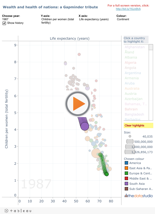
As soon as I got my hands on Tableau v6, the first thing that came to mind was Gapminder. Those new shiny features meant it would be possible to recreate the amazing Trendalyzer software in Tableau. Here’s how I did:
To do the viz, I took advantage of lots of the new features, many of which I have already blogged about.
Data Blending
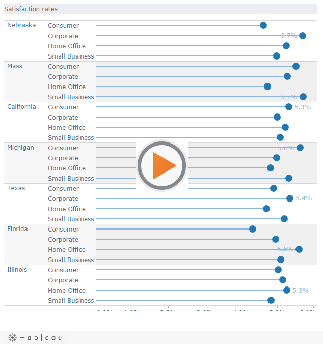
There are 9 connections required to show the viz above:
Okay, I acknowledge that that is not a shade on Gapminder’s 250+ datasets. But, hey, I’m not Google, you know! Tableau coped well with 9 datasets. What was difficult was reshaping the Gapminder data in Excel in order to get the best out of it in Tableau. Don’t know about Reshaping? Then you need the Tableau Reshaper add-in…
Parameters
There are lots of parameters in this viz. Mostly, I used them to enable the user to choose which Dimensions/Measures to display on the viz. You can read about how to do that in my earlier Joy of 6: user-built views post.
Page controls
At last, the Page Filter grew up. A valuable but neglected feature in previous versions, it’s been beefed up enormously this time around. The viz takes full advantage of Page filters and the ability to Show History. Click on a mark in the viz to see how it’s changed.
The single, pretty major issue is that on a Server or Public view, you don’t get a Play button. Given the architecture of the Tableau Server, this makes perfect sense: it is simply not possible to get data from the server to the client quick enough to work. You need to download the workbook to see the playback controls. This is a shame, as it’s a cool feature.
Tabbed views
My favourite “easy-win” from the new features is the ability to use tabbed views to create an About Box (read the blog post about this). In this viz, it allows me to create links to the source and other places, and add context to the viz. Without the About Box, I would either have to miss those out, or use up valuable screen real estate on the viz itself.
Challenges?
This project was not without challenges…
Gapminder data interpolates
On the Gapminder site, if a data point is missing, it interpolates the value. That makes for a nice smooth animation on their website. Unfortunately, Tableau cannot invent data in that way. See those lines through the circles in the image above? That’s where Gapminder interpolated in order to make a smooth interpolation.
Log and linear
Gapminder automatically switches between log and lin axis scales. This is really nice, as it removes the burden from the user, and makes everything fit properly. Alas, no such feature in Tableau as yet. I wouldn’t even expect Tableau to implement this – it’s a very niche feature.
Annotations: two problems.
See the light-grey label showing Year that appears on the chart itself? In Gapminder, that label fits the whole chart. in Tableau, area annotations are at the front, so if you try to recreate labels as large as they are in Gapminder, the obscure the data points. But that wasn’t the biggest issue. Oh no. The area annotation is specific to the Dimension being selected. Therefore, I needed to add a separate annotation for every single X-Y axis combination. That was pretty tedious…
Some Gapminder data is just plain wierd
I had to pick and choose the data I used for this viz. In some cases there were too many missing data points. And in others, the values just don’t seem credible. For example, if you choose the CO2 emissions Dimension, well, I just don’t believe those values.
Conclusions
This has been a pretty challenging viz to get right. Having a defined end-goal (Gapminder) to try and hit isn’t the normal way of developing in Tableau. It’s better to explore the data, find the story, and tidy things up when you get to wherever you’ve got to. Forcing Tableau to be like something else is trickier.
Tableau isn’t optimized as well as Gapminder. Tableau can’t match Gapminder for smoothness of animation or flexibility of showing the different data. But that’s not really what Tableau is trying to do. It does everything it needs to do in this project just fine. Most of your business applications will be simpler than this. I think the end result above is great. It was a great way to explore the new features.
I hope you enjoyed the project, too. This is the end of my Joy of 6 posts – click here to read the rest.


7 Comments
Add Yours →Once again Andy….very nice work! However, in this case the space constraints of a web-embedded view actually detract somewhat from the visuals. The data needs a little more horizontal breathing room. However, I understand that you have to fit in the constraints presented.
Nice work Andy! Did you consider using the page shelf for years and turning on trails? That makes a really nice view.
:)ross
Doh! should have read closer. I see that you did that. Nice!
:)ross
@Dan
Thanks for the comments. Yes, you’re absolutely right about the size problem. That’s why I also made the full-screen version (http://public.tableausoftware.com/views/GapminderFullScreen/Gapminder?:embed=yes&:toolbar=yes&:tabs=yes).
Fitting the viz into a blog certainly required compromises. I probably should have mentioned this in the post itself – it’s a real point to consider: sometimes things just can’t be made small enough. I tried all sorts of layouts to keep things in the small size, but every option compromised something else. The one above was the best I figured I could get to.
@Ross
The trails work really nicely. I think (but have no real figures) that this viz is slower on Tableau Public than others. Certainly in Tableau Desktop, it takes a while to refresh the views. Do you think this is because of the multiple connections, the pages, or simply the complexity of the views?
Great job Andy. As we discussed a few weeks ago, the absence of the play buttons on Tableau Public is annoying in this case. Perhaps Ross can explain why this is? It works in the normal version of server right?
Cheers
Tom
Hi Tom
No, the play buttons don’t appear on Tableau Server either. It’s annoying, but given the architecture of Tableau Server/Public, it’s fairly reasonable. The data lives on the server. If you are going to animate a viz, the data has to get sent from the server for each “frame”. Maybe that’s possible for a view with only a few data points.
But what if we tried it on the Gapminder view above? There’s about 100 data points on there, not including the trails, if you’ve got them on. There’s no way Tableau Server/Public could get the data down to the browser quickly enough.
How do other online viz applications solve this? Well, the “real” Gapminder seems to load the data in the browser.
Andy
@Tom
Yes, we spent a lot of time thinking about how to animate, but given our current architecture it would be prohibitively expensive from a bandwidth perspective. We’re continuing to work on the problem though.
Gapminder and others render on the client instead of server (often using flash).
:)ross