Yes, yes, my previous post was a Bar Chart Race bashing post. As I said in that post, my negative opinions are tongue-in-cheek. I *do* think they’re a fad, but I do know they make compelling data stories, especially for the non-expert data visualization crowd.
Right now, Tableau’s new animated transitions are available to test in beta. This provides many new opportunities, one of which is to build a Bar Chart Race. Paul Isaacs (on the animation team) and Joshua Milligan (a Zen Master) both shared some ways to make them. I also got some advice from Jonathan Drummey. Thank you to all whose ideas formed the basis for this post. There’s a link at the end of this post where you can download my workbook.
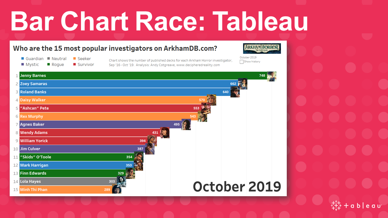
The Bar Chart Race in the video above shows data from ArkhamDB.com. It’s a fan site that allows people to create custom decks for Arkham Horror The Card Game (a narrative, cooperative game set in a universe inspired by the work of HP Lovecraft).

If you’re interested, I have an entire blog – DecipheredReality.com – dedicated to the data behind this game. But for now, let’s build a Bar Chart Race!
The underlying data
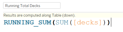
Each record in my dataset represents a deck created on the site. It has information on the character (“Investigator”) used and the Creation Date. To make a basic bar chart race, we need to know the running total and the rank. The running total looks like this:
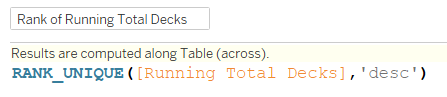
And the Rank calculation looks like this:
Assembling the chart, part 1
With a running total and a rank, you can build the Bar Chart Race. Drop the running total on Columns and the Rank on Rows. Then put your time dimension on the page shelf (in this case, I chose Months) and you’re looking like this:
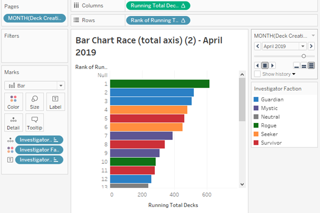
Press Play on the pages control, and you’re done. Or are you? Here’s what your bar chart race will look like: loads of white space!
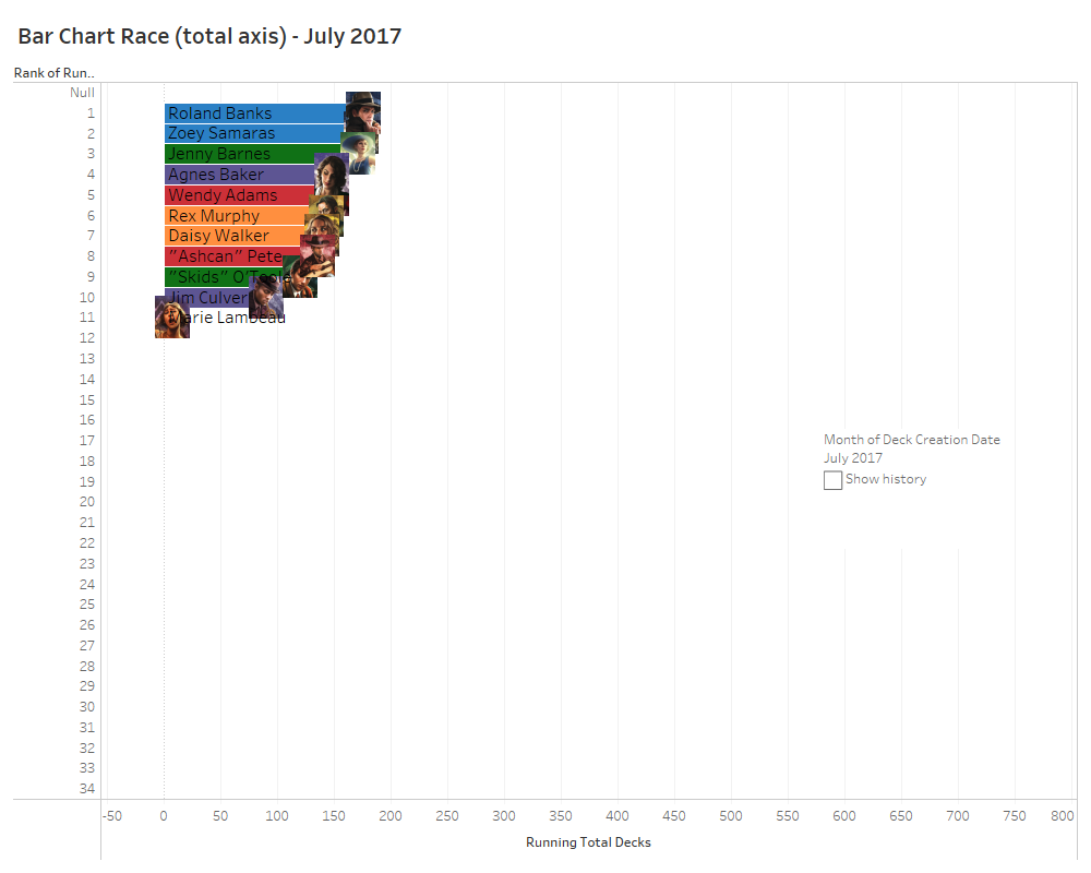
There’s a problem. In a “classic” bar chart race, the highest ranked bar always fills the available width of the chart window. In our example above, the bars start small and slowly fill up the screen. This is because of how Tableau’s Page Shelf works: it indexes all the values of all the pages first, and builds its axes according to the biggest value across all pages.
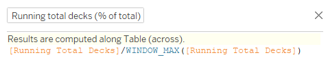
Darn! We’ve not made a “classic” Bar Chart Race. Problem solved with the calculation hack that Paul Isaacs shared in response to Joshua Milligan’s tweet:
By making the bar length show percent of total, we can ensure it fills the width. With that, I can build the calculation below and use it on the Columns shelf instead:
And you’re done! In my final version, I prettied things up with Shapes, labelled lines and by putting the Page Name in the chart white space.
Getting the animation right
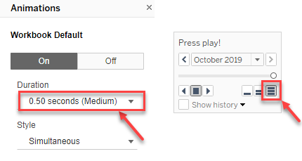
Once the dashboard was built and everything was formatted correctly, it’s time to tweak the animation. After some experimentation, I found the best option is to set the Page Shelf speed to maximum, and the Animation Speed to Medium. Workbook animation settings can be found in the Format menu.
Bar Chart Race: discussion
Now we have a Tableau Bar Chart Race, we can ask: how do we feel about them? How do they compare to those you can create on Flourish or other tools? Here’s the same data, built using Flourish Studio:
Here are some thoughts on the process in Tableau:
- I’d love to see more control over the speed of the Play Shelf animation. I like the end result of the animation speed, but I’d rather have a bit more control on the Page Shelf speed.
- I’d also love the UX of the Play Button to be updated, so it’s a bigger target and looks more like a modern play button.
- More than ever, I’d love an “export GIF/video” feature in Tableau!
- The bar chart race implementations from Flourish interpolate values between two time points. This makes for a continuous animation. It’s a bit of a cheat because the growth between time periods may not be uniform, but it makes for a more pleasing animation experience. Is the smooth growth a valid deception made in order to make the viewing experience better? What do you think?
- In Flourish, the x-axis is animated too, so even if one bar stays dominant, you do get the sense of the speed at which it’s growing. You don’t see that in Tableau. Which got me thinking. Remember I said it’s a problem that the bars aren’t always full-width? Well, that’s only a problem if that’s what you expect Bar Chart Races to do. What if I want the bars to grow from small to large? In which case, the prettified end result would look like the video below. What do you think? Which do you prefer?
- Finally: I think both end results in Tableau is really good. We didn’t implement animated transitions in order to build Bar Chart Races, so it’s a happy accident that they look this good. They aren’t even that complicated to build. It took me about the same time to build the Tableau version as it did to make the Flourish version.
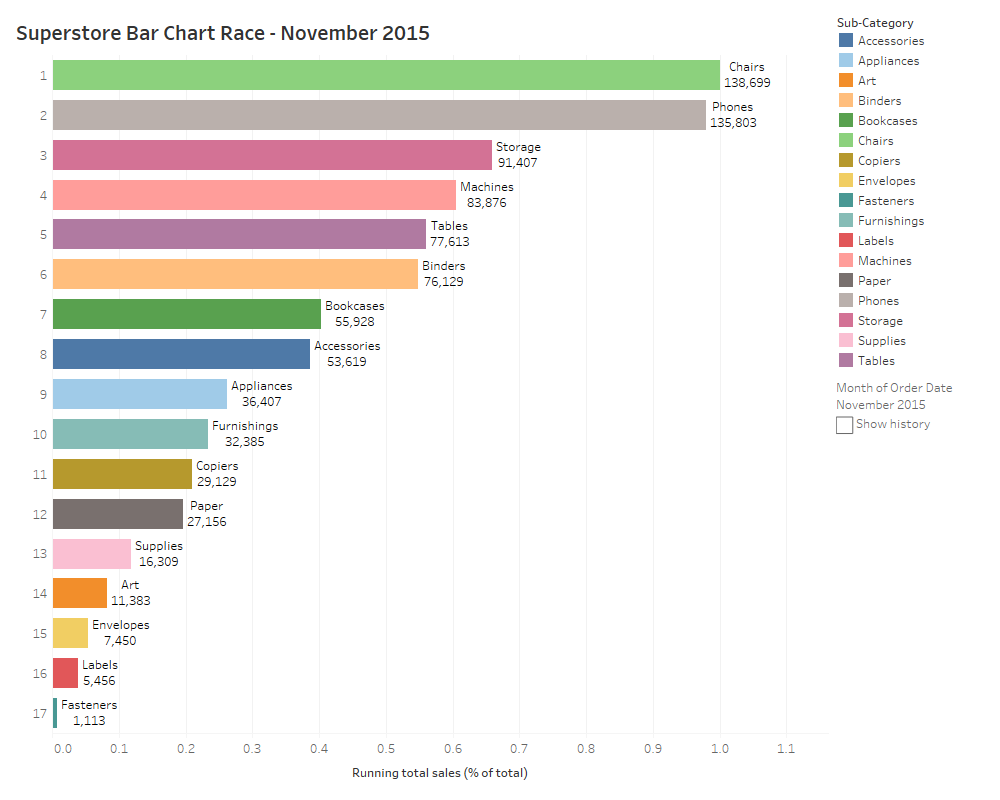
I hope you’ve enjoyed this post. You can download the workbook here. It also includes a Superstore Bar Chart Race you can play with
I’m really excited about the new animated transitions. Whether it means we should be making bar chart races or not isn’t really the point: this post has been about exploring the new feature and thinking about the new design space they open up.
I’d like to give a huge thanks to all the Tableau Animation team. If you didn’t see them in Devs on Stage, check them out here, with Victoria showing the more analytical side of the new feature:
And if you want your hands on this feature RIGHT NOW, please join Tableau’s beta program by clicking here.


3 Comments
Add Yours →Hello Andy
Thanks for sharing this content.
I tried to follow your tutorial for the race bar chart, the only thing that is not working is the rank, the values of the countries are increasing according to the value and the year but the position in the graphic remains fixed ( The countries are ordered in alphabetical order by default ). the rank formula is this one: RANK_UNIQUE(SUM([cases]),’desc’). do you have perhaps have an email to show you what’s happening? what can I change in order to make the highest countries to appear on the top?
Thanks for this walk through! I tried this and it will not keep a running total. I even downloaded your workbook and recreated the fields word for word. It is only showing the total sum for the current month that it is currently in the view. Any thoughts on that?
Thanks again!
Can I have race-bare-chart -to