Hello! This is my final set of reflections after a year of covid-19 charts. You can see parts one and two, and do let me know what you think on Twitter or LinkedIn.
Data-informed conversation requires data literacy skills
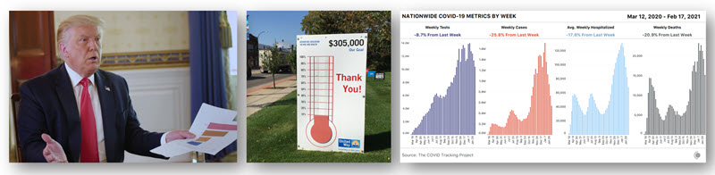
(Donald Trump’s Axios interview, August 2020)

In an interview with Jonathan Swan of Axios, Donald Trump used printed charts to argue that covid-19 was not as bad as the media reported. To my mind the exchange revealed two fundamental data literacy failures. First, he misunderstood the underlying covid-19 data. Second, he misinterpreted the charts. As a result, the conversation was not informative. Whatever way we lean politically, it showed the importance of a foundational knowledge of data literacy. You, your colleagues, you bosses, your team: all should have a greater grasp of data, and how it is used to form insights. If, through intent or through ignorance, we misinterpret what our data is showing, we cannot progress to making better decisions in the future.
Complexity cannot be reduced to a single KPI
(Jake Berry’s “fundraising thermometer”, August 2020)

Criticising a lack of a route out of a national lockdown, UK Conservative MP Jake Berry demanded his government provide clear data on progress against the spread of covid-19. So far, so good, until he suggested a church fundraising thermometer-style display as a solution. Really? Reduce a highly complicated, fast-moving situation to a single number? There is no single number that could possibly capture the nuance, however appealing the desire for one. I challenge you to think for a moment: what single number could be used in this format to help the public see a route out of covid-19 restrictions? I asked Jake Berry the same question but got no response. Fortunately, the UK government’s latest “data-not-dates” approach looks at multiple values to decide on easing restrictions.
For more background on why Berry’s call was naïve, and how business data can fall into the same trap, I highly recommend The Tyranny of Metrics by Jerry Muller. I wrote more on the topic in Computer Weekly in December.
Sometimes you have to find the data yourself
(Covid Tracking Project, March 2020 – March 2021)

As discussed in the first of this series, the start of the pandemic revealed a lack of data. Rather than wait for official datasets to improve, journalists at The Atlantic began curating their own covid-19 data. That grew to become the Covid Tracking Project, a volunteer organisation collecting covid-19 data from across the US. Its data is used by national and local bodies across the US, and their API gets ~2 million hits a day. Its impact has been enormous. The data even became Biden’s Transition Team’s covid dataset after being denied access to the official data used by The White House.
The project shows that the drive to measure, quantify and analyse is immensely strong. Data needs to inform our decisions; without good quality data we are flying blind. A project run by hundreds of volunteers that helped thousands understand the impact of a pandemic seems like a fitting way to end this series. For more on the project, check out my If Data Could Talk with Peter Walker.
That’s all for now! If you have comments or questions, let me know on Twitter, or LinkedIn. I’d love to know what lessons you think data communicators can learn from a year of covid-19 charts.
Best wishes


1 Comment
Add Yours →[…] worth of COVID-19 charts; Part 2 looking at charts as the pandemic accelerated its impact; and Part 3 rounding out key charts and lessons learned about data communication. COVID-19 has transformed the […]