Welcome to the Sweet Spot – 3 data-related stories to read/watch/listen to. If you’d like to subscribe, click here.
As we roll-through multiple covid-19 anniversaries, I’m going to spend the next 3 Sweet Spot posts looking back at the charts that defined the pandemic and, for each one, what they tell us about data communication.
For each chart, I’ll explain how it demonstrates a challenge all data-informed organisations face. I’d love to know your thoughts!
Before starting, Chart Chat is back on Jan 28th – you can sign up here – and do let me know your thoughts on Twitter.
Don’t wait for perfect data before starting
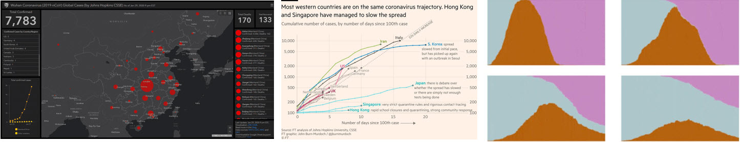
Johns Hopkins University Covid-19 dashboard, Jan 22

Johns Hopkins University first published their dashboard on Jan 22. The goal was to provide a user-friendly tool for the public, researchers and policy makers. Data collection was haphazard and unreliable: updates were manual and came from Twitter, emails, and news sites. At this point, though, any data was better than no data.
Over time, data collection was improved and automated. Dashboards are never finished: they need to evolve as data improves and questions change. The JHU dashboard was initially a blunt, inaccurate instrument, but the visitor numbers (200 million per day in January) indicated how the coming pandemic would be one driven by data.
Take the insight to the audience, and iterate your design
John Burn-Murdoch’s Tweets, starting on March 11

As the pandemic progressed, it was natural for people to compare their country to another. Johns Hopkins’ static views didn’t provide the narrative a nervous public wanted. John-Burn Murdoch’s brainwave was to take the charts to the audience by using Twitter to share updated views every day until April 26.
There he found an audience who wanted to engage, query, and debate the data. Over a period of 6 weeks, his daily updates iterated on the original theme, generating thousands of comments, and exceptional levels of engagement.
John introduced visualization choices that lay people might not have encountered in the past: anchoring the x axis to a milestone (days since x cases) rather being a normal timeline, and using a log scale on the y-axis. Log scales are important for tracking exponential growth, as we came to learn, but also made sense from an aesthetic perspective, as John explains in this interview with Jason Forrest.
For me, there are 2 important lessons from his Twitter charts:
First, data-informed conversations are powerful.
By March, the narrative was focused on comparing “my country” with “another country”. At that time, most European countries were comparing themselves to Italy, which was having the most serious outbreak. John’s tweets received thousands of replies with questions, disagreements and arguments. Stressful for John, sure, but a sign of a healthy data conversation: if people are responding, it means they are engaged. When people question why you made a decision, it means YOUR decisions made them think about the display.
Second, iterate to find the best articulation of the data.
The final chart John tweeted, on 25 April, was very different to the first one. The charts had evolved. A healthy data driven culture thrives on iteration. Each new day bought new nuance to the story, and John responded. Each tweak was folded into the greater audience’s understandings because they happened incrementally. Imagine charts in your own working life: would it be better if they evolved over time to reflect the way you analyse your organisation?
On 26 April John pivoted to entirely new charts, showing excess deaths. We’ll cover why in the next Sweet Spot, when we look at The Economist’s versions.
Data *can* change behaviour
Flatten the Curve, Washington Post, April 14

The data visualization field has often struggled with the challenge “Sure, charts are great, but can you show me an example where data visualization actually changed behaviour?” We’ve previously relied on historical examples to prove change (Florence Nightingale, for example)
“Flatten the curve”, an abstract representation of outcomes from different levels of lockdown, drove the biggest behaviour changes asked in our lifetimes. This was especially true in North American and European countries who had no living experience of highly contagious diseases. Concepts of social distancing, exponential growth and lockdowns, so familiar to us now, were unknown at the start of 2020. “Flatten the curve” chart explained why the change was important.
Versions of the chart appeared in just about every government press conference, every media site, and flooded social media. For me, the Washington Post was a particularly powerful example. Harry Steven’s article communicated so much of what the public needed to know, through engaging animations.
Flatten the Curve charts were built on assumed data, but this is not a weakness. Charts show opinions and arguments, not unbiased factual representations of reality. This chart took that maxim to its furthest edge. Real data would have been bumpy and incomplete, but the goal of this chart, excellently summarised by The Pudding, was to show one thing: ”The big hill is worse than the small hill so change your behaviour now.”
I interviewed Harry Stevens for If Data Could Talk where we explored how he came up with his ideas, and why this chart was so successful.
And there’s more…
In the next post, I’ll be covering excess death charts, local government dashboards, Trump’s Axios dashboard, and more. In the meantime, let me know which charts of the last year you think have taught us, as data users, the most important lessons.
In the meantime, here’s some other activities you can get involved with:
- Chart Chat is back on 28 January. I’ll be joining Amanda, Steve and Jeff to discuss the latest good and bad data visualizations that we’ve seen in the last month. Click here to register.
- If Data Could Talk. I had a great conversation with Julia Lane on democratising data in the US government.
Stay safe, and see you soon for the next issue of the Sweet Spot. Do subscribe to the newsletter, if you would like to get these in your Inbox:
Andy


3 Comments
Add Yours →[…] Note: This article includes excerpts from a three-part series by Andy Cotgreave: Part 1 an examination of a year’s worth of COVID-19 charts; Part 2 looking at charts as the pandemic […]
[…] стаття включає уривки із серії статей Енді Котгріва: Частини 1 — оцінка діаграм за цілий рік COVID-19; Частини 2 — […]
[…] Gravy Anecdote | ‘After 12 months of covid-19 charts, what have we learnt?’ […]