Welcome to Sweet Spot #59. Last time I looked at 3 data visualizations from early in the covid-19 pandemic. This month, I’m looking at how things continued from April onwards, and what we can learn from them.
Use proxy data; complex metrics need slow introductions
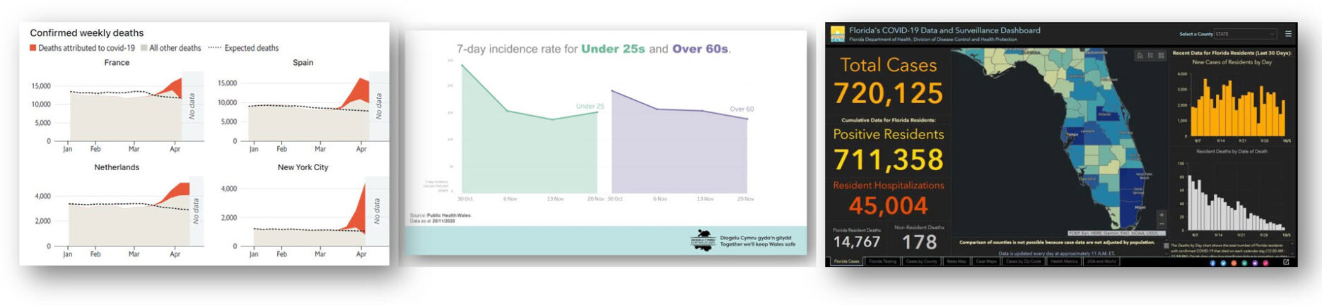
The Economist excess mortality charts, April 2020
By April we knew that accurately counting covid-19 deaths was problematic. Undercounting risked downplaying the situation and made comparing countries difficult. We turned to “excess mortality” as a way to identify the problem. This measure compares actual deaths to the long-term average deaths in a given period.
The Economist first covered this on April 4th and set up a long-term monitoring page on April 16th. I took two lessons from the change of metric and the charts:
When it’s not possible to track something directly, look for other (proxy) indicators. Excess death charts appeared when the world was seeking more accurate information on the severity of the pandemic. Many nations were not able to accurately report covid-19 figures but do have reliable death statistics. If you are struggling to measure what’s important, is there another dataset you have access to that provides a similar perspective?
A new metric requires a detailed chart, but can be simplified over time. The Economist’s early iterations of excess death charts (above) were complex. When Ed Conway introduced the measure on Sky News, it took five minutes to explain. Understanding “excess death” requires understanding various other numbers (expected deaths, deaths attributed to covid-19). Eventually, familiarity with a metric can allow the chart designer to simplify the display, something I predicted in April’s If Data Could Talk.
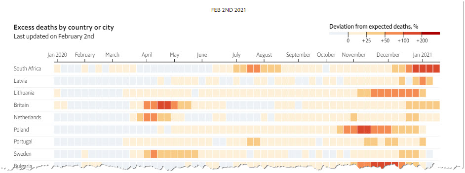
The Economist’s page has now evolved to show a simpler highlight-table (above) with a much-higher information density. When you communicate data, ensure people understand complex metrics, and adapt displays as your audience matures.
Make data personal (and transparent)
Myriad local government dashboards

As the pandemic continued, people transitioned from national to local: what’s happening near me? What action do I need to take to help my area? How can I stay safe where I am? At this point, global and national KPIs are meaningless; people need data that is relevant to their activity.
Simultaneously, the nitty gritty of how policies were being decided became more important, and arguments about transparency grew.
Florida’s covid-19 dashboard became mired in controversy as GIS-expert Rebekah Jones was fired after claiming the state governor’s office had demanded she manipulate the data. Georgia’s state dashboard was also mired in controversy, with allegations of misleading data, poor design choices, contradicting numbers, and problems with transparency. This excellent report in The Atlantic explains the issue in detail. Trust in data can only be achieved when it is transparent.
There are many examples of success, of course. You can check out If Data Could Talk episodes with analysts from the Covid Tracking Project, ProPublica and El Paso school district for examples.
How (not) to present data
Government briefings

Charts convey opinions. They can persuade as effectively as the written word, depending on their layout and formatting. See my remake of Simon Scarr’s Iraq’s Bloody Toll chart for an example.
Throughout the pandemic, press conferences and briefings have been the main interface between government officials and a nervous public. Officials thus must design charts with intent: do they format them to persuade? Or should they aim for neutrality? When these questions are not considered, incomprehensible charts are the result, which damage trust in the data. See this Welsh Government chart for an example. Here’s an example from the Welsh government, which I remade here.
Giorgia Liupi and the team at Pentagram also addressed the with a redesign of New York mayor’s briefings. I explained the issues in this Computer Weekly article.
The presentation of data is the last mile, where you can persuade others. Invest time in this stage; do not copy-paste something without considering how it looks to an audience.
Stay safe, and see you soon for the next issue of the Sweet Spot. Enter your email below to subscribe.


2 Comments
Add Yours →[…] three-part series by Andy Cotgreave: Part 1 an examination of a year’s worth of COVID-19 charts; Part 2 looking at charts as the pandemic accelerated its impact; and Part 3 rounding out key charts and […]
[…] Частини 1 — оцінка діаграм за цілий рік COVID-19; Частини 2 — розгляд діаграм, як пандемія прискорила свій вплив; […]