This is the final post in my DataPlusMusic series: I hope you’ve enjoyed the series and are inspired to find out more about your own listening habits.
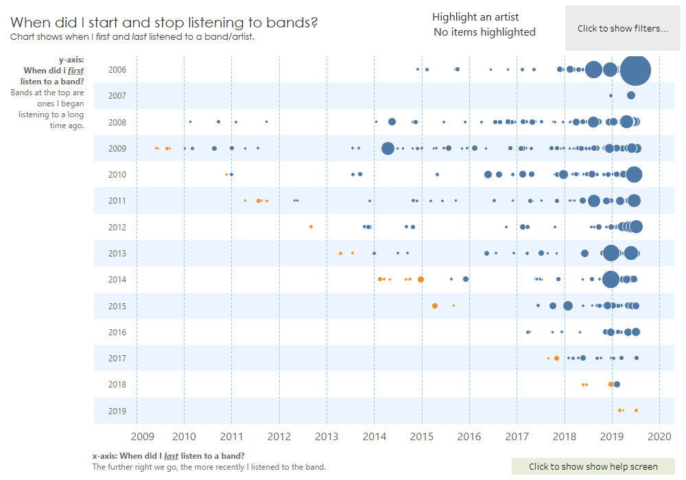
In this post, I’m sharing a viz I use to look for old favourite bands that I’ve stopped listening to. The viz is a little complicated, so let me explain it.
Each dot is an artist. It’s position shows when I first and last listened to them. The size shows how much I’ve listened to them.
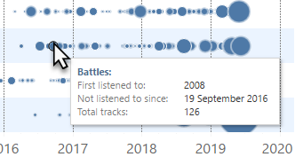
Above is Battles – I first listened to them in 2008 and last listened to them in 2016. I listened to them a total of 126 times.
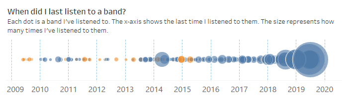
The x-axis shows the most recent time I listened to a band: the further to the right, the more recently I listened to them. Here’s the chart with just the x-axis. That big dot on the right? Queen: I’ve listened to them a gazillion times, and in the last few weeks.
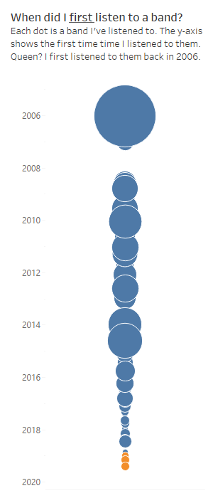
The y-axis shows when I first listened to a band. 2006 is at the top: so the bands up there are ones I began listening to a long long time ago! Once again, Queen’s the big dot at the top: I’ve been listening to them forever.
Combine the two, and you have the matrix. Showing my listening history.
I use this to find artists to revisit. I’m looking for bands in the red circle below: these are bands I started listening to a long time ago, but haven’t listened to for a few years:
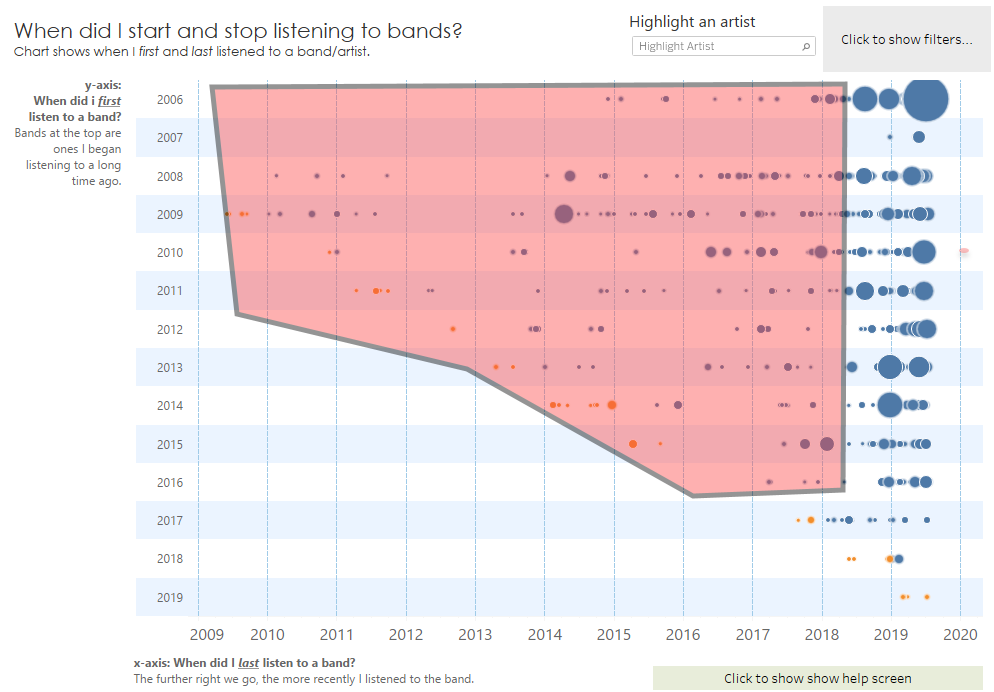
Dots in the red area are old favourites. The bigger the dot the more I used to listen to them.
You can interact with this to discover all the great (and not so great) music I’ve listened to over the years. If you’ve got your own data, can you recreate this view and find your old favourites?
Let me know what you find below or on twitter. (@acotgreave).
Recent Comments