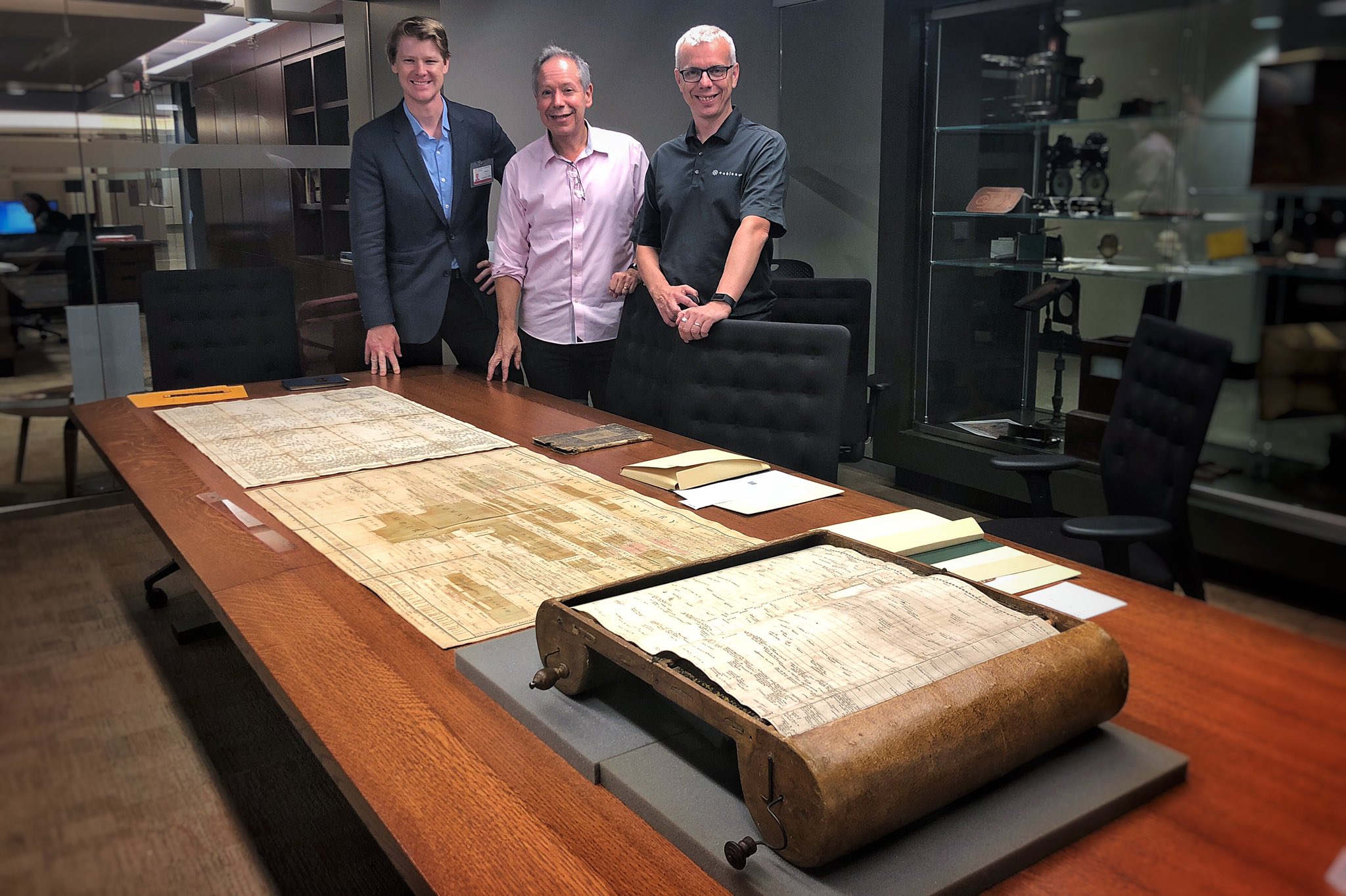
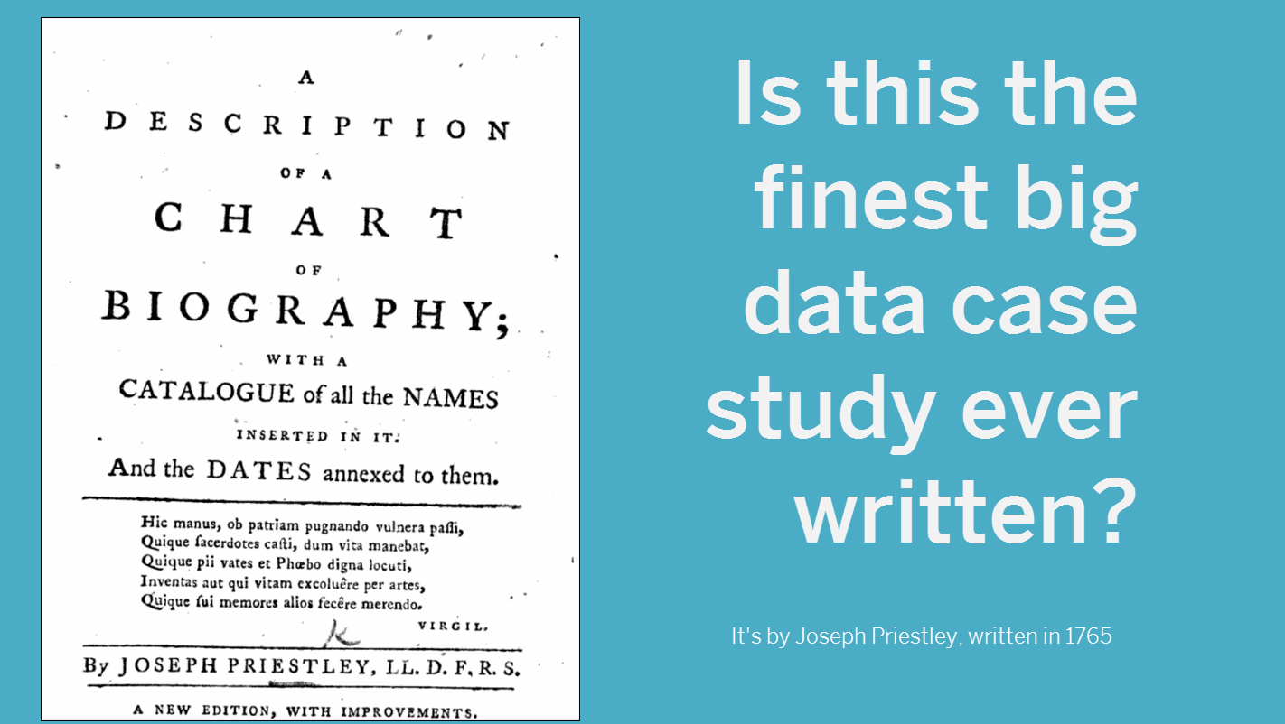
This is the final post about the wonders of my visit to Princeton to see some of the best examples in the history of data visualization. In my first post, I covered DuBourg’s 1753 Charte Chronographique. Part 2 looked at Priestley’s 1765 Chart of History. In this final post, the climax of the visit was when the Chart of Biography was also brought to the table.
This visit had surpassed any expectation I could possibly have had. On the table in front of me were three pieces vital to the history of data visualization. These pioneers’ ideas form the DNA of every chart we build today. It was a privilege to have them on one table in front of us.
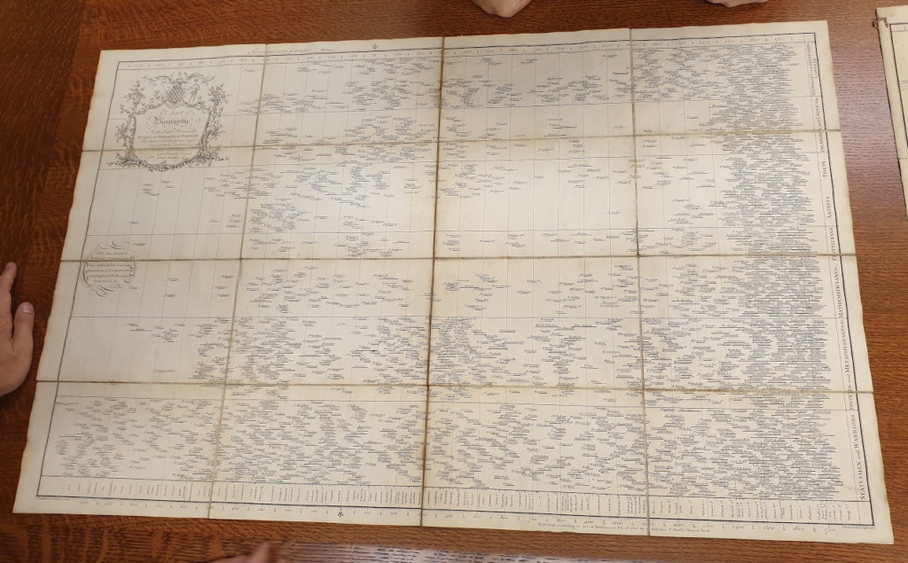
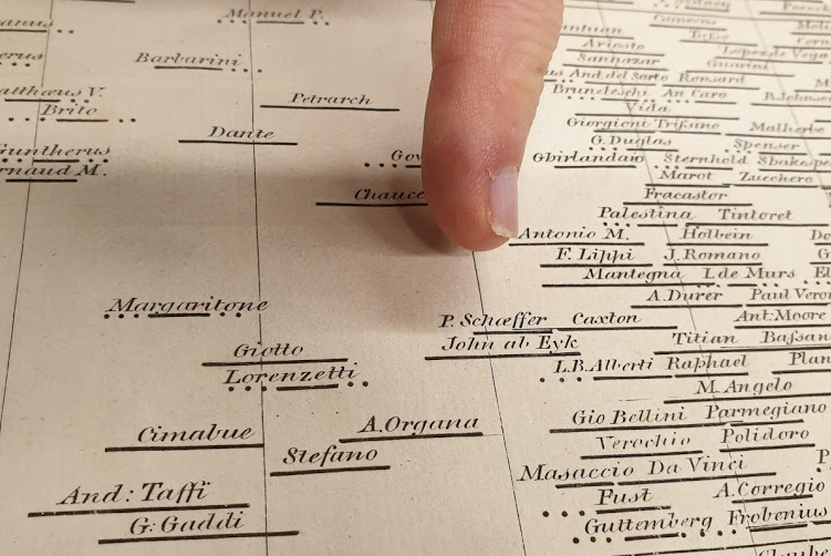
The chart of biography shows the life spans of over 2000 people of note, from 1200BCE to 1765. The x-axis shows time, and the horizontal groupings organise people according to their type of person they were (politician, artist, statesman, warrior, etc). Priestley’s intent was to show the history and development of humanity with one sweep of the eye.
Like the other pieces, seeing the pieces live is a completely different experience to looking at photos. I’ll try to convey some of what we discovered.
First of all, every chart needs a good title, and, boy, Priestley knew how to make a good title. Check this out:
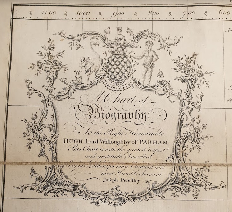
Try making a title like that in your next dataviz!
Second, all great data projects have a description to accompany them, and this one was no different:
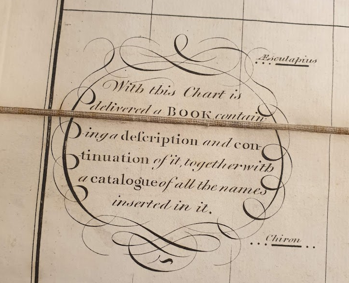
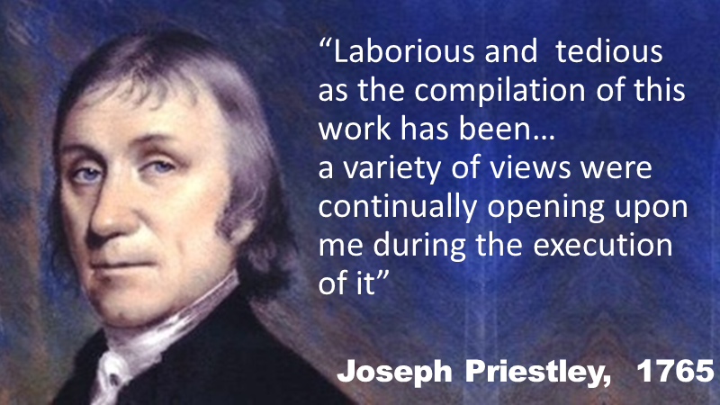
Priestley wrote a wonderful description of the data project, explaining the difficulty of data collection, the beauty of exploring data, and the reasoning behind his visualization choices. It’s a very good read and one I’ve blogged about previously.
The marks are Gantt bars. The length represents the lifespan of each individual:
I described in my previous post how Priestley was visualising uncertainty. He does it here, too. The dots show where the birth/death year of an individual is uncertain.
In some cases, there is very little certainty about someone’s timeline. For example, the specifics of Hillel’s birth and death are not known:

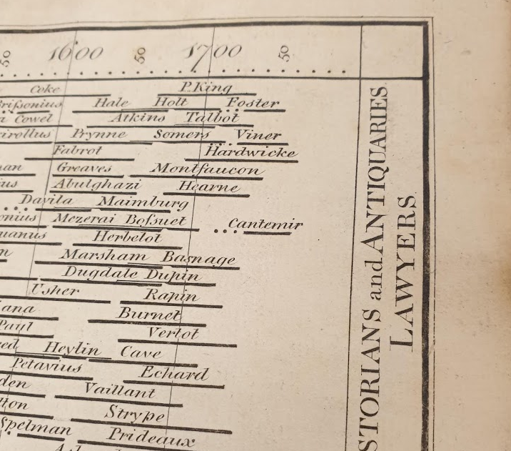
As with the Chart of Biography, Priestley also future proofed his chart by leaving space for new additions to be added to the engraved plate. He made the chart in 1765, but extended the axis out to 1800:
At this point, I was sated. We had a table with three of the most important visualizations of all time on it. My visit had surpassed every possible expectation.
What does it all mean? The historical visualizations teach us so much:
- Most of what we worry about today in our field has been worried about for a long long time.
- When you create a chart in software, you’re repeating the steps taken by pioneers from 250+ years ago.
- Creativity stems from many places. The pen and paper are mighty tools to think differently and open up new ideas.
Feel free to go back and look at the first two posts, about the Carte Chronographique and the Chart of History.
Recent Comments