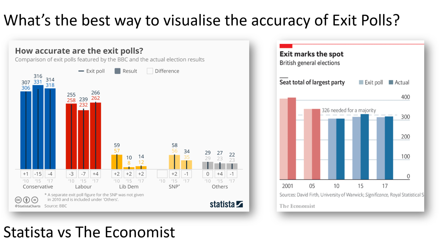
My last post was about opinion poll tracking. Well: today is election day, and we’re all excited to see the results of the Exit Poll. I’ve seen two charts today explaining how accurate the Exit Polls are. One is from Statista and the other from The Economist.
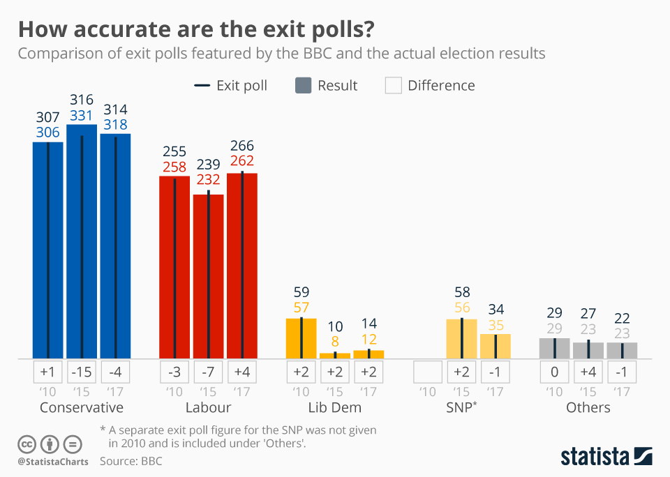
Here’s the one from Statista:
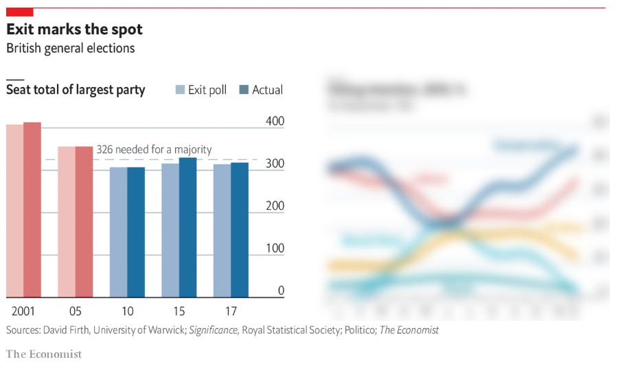
And here’s The Economist’s (I’ve blurred out the chart on the right because I want to focus on the chart on the left:
Both of these charts are interesting for different reasons. The Statista chart packs in a lot of information. I can see predictions, outcomes, and variances for each party over 3 different elections.
The Economist sacrifices detail for the sake of rapid comprehension.
And that’s the dilemma we all face. Do you prioritise speed or detail in your visualization?
The Statista chart took me well over one minute to parse. It is a complex chart with some unusual constructs. Below is the Lib Dem section: the thin black line and black number is the Exit Poll prediction, the yellow bar and number is the actual result, and the numbers below the bars show the difference.
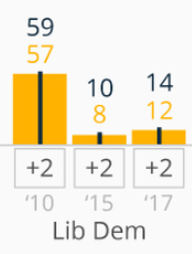
Even knowing what it all means, I find it a cognitive challenge to parse the info. But I can come away with a lot of detail.
The Economist on the other hand eschews all the detail in favour of rapidly conveying the point: Exit Polls are accurate.
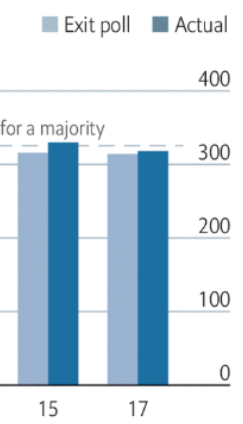
Do I have a preference for which I prefer? In a fast moving news day, I prefer The Economist version: it makes its point quickly and simply, sacrificing detail for speed. This doesn’t mean the Statista chart is bad: it has more information and my judgment is based purely on my objective (fast comprehension) which might not be the intent of the chart’s creator.


Recent Comments