The UK General Election campaign has officially kicked off. Once again, we face five weeks of data manipulation, deception, and bloopers. Perhaps naively, here are two hopes for the coming weeks.
Data Deception from the politicians. An inevitability?
Already there have been charges of fake news and it is expected there will be incidents of parties of all sides also employing “creative” use of data and statistics to land political blows fairly and unfairly.
My one great hope is that politicial parties and the media think deeply about how they present data. In today’s political landscape, the proliferation of data is becoming more prevalent and being turned into a political weapon.
Here’s an example:

The above ad has been shown to more than a million people on Facebook. The Conversvatives admitted their calculations were wrong and that the number is incorrect. See Channel 4’s Fact Check for more details.
Visual literacy
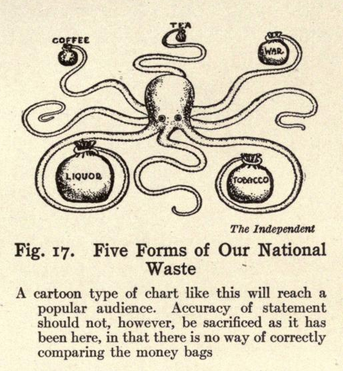
Data and visualizations are routinely used and abused. This is an insult to the electorate and a sure way to further reduce trust in politicians.
This is not even just about deliberate deception, but also about how a lack of fundamental data literacy skills does us all a disservice. Even well intended data can be infliuenced by poor chart choices. The BBC’s published “11 charts on why the NHS matters in this election” on 5 November. The data in the article is sound, but some chart choices were not ideal for conveying the intended messages.
This is a complicated issue and it’s hard to solve. Journalists are under intense pressure to turn articles around quickly, and yet they are expected to be held to high standards. A chart should be as “readable” as a well-crafted paragraph in an opinion piece.
It’s about thinking beyond the default charts your software provides, and think about how to make it easier for your audience to understand the message. This is about choosing the right chart, and doing everything you can to design it to reduce the cognitive load on the viewer.
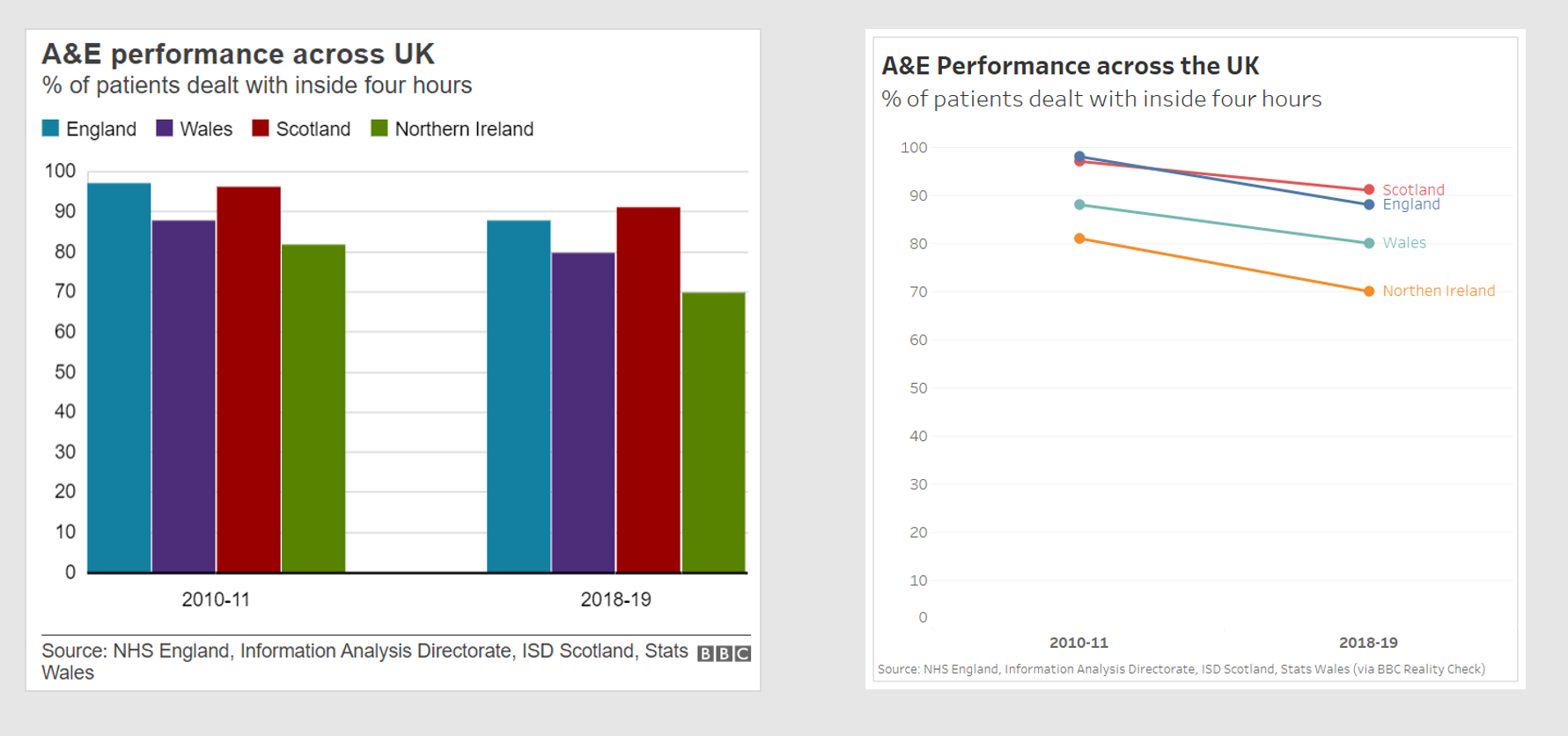
Here’s two examples from the article. Consider the chart comparing A&E performance.
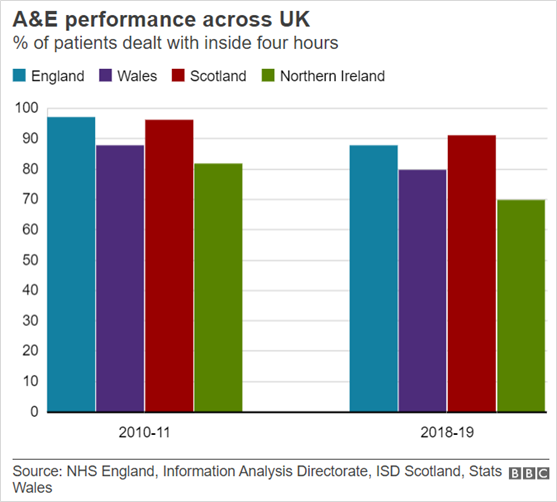
The article discusses how the different regions have changed over time. Can you compare regions in the chart above? I don’t think it’s easy. One alternative, a slope chart, makes it easier to compare regions over time.
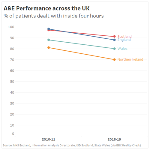
Another chart is used for discussion on the aging population, looking at Age Group distribution today, and in 2050. As you read the chart below, pay attention to your eye-movements as you decipher it.
Your eyes are all over the place, right? To fully decipher the story of the data, you’re spending time moving eyes from the pie slice, to the colour legend, to another pie slice, back to the legend, and so on.
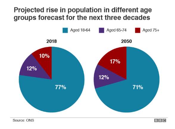
How about this version instead?
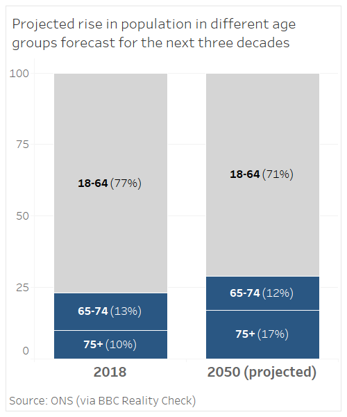
It’s easier to read, right? You don’t have to keep looking everywhere to see the message of the chart.
UPDATE: 9 Dec. The BBC republished the article this week (9 December) and reworked the Aging Population Chart (below).
The electorate wants truthful, clearly communicated information. Deliberately lying and bending the truth is unfortunately a reality of today’s politics. Organisations such as FullFact, Fact Check and others do a great job sifting the facts from the lies.
Data journalists are also doing their best, with multiple demands and tight deadlines.
Citizens deserve better: we want honesty and clarity, and I hope, possibly naively, that this might be the election where data deception is called out.


Recent Comments