
Have you ever seen a checklist for people to determine if they have designed a successful dashboard? I don’t think I have.
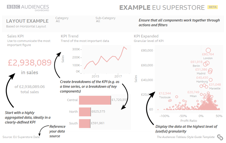
What would it contain? I was talking about Style Guides with a colleague, focusing especially on the excellent BBC Tableau Style Guide (it’s amazing: go check it out).
Looking beyond the style of a dashboard, what about the purpose?
Help me crowdsource a checklist a dashboard designer could use to ensure they’ve thought through exactly why they chose each design element. I could easily produce a beautiful BBC-style dashboard using the style guide, but how would I know it’s answering the right business questions?
What would a dashboard design checklist look like?
Which lead me to think: what questions could someone ask a dashboard designer to be sure they have thought about the purpose? I started with this list, what else would you add? This could easily be a self-assessment check list:
General questions
- What business question does your dashboard answer?
- Which charts show summary information? Which charts show detail information? Why?
- In what order will people read the components of your dashboard? Why?
Individual components
For each chart on your dashboard:
- Why did you choose this chart?
- Is this chart showing summary or detail information? Why?
- What business question does it answer? How does it answer that question?
- How have you indicated key points that require further investigation
I need your help!
What questions would you add? How could you use questions to encourage a dashboard to critically look at their dashboard?
If you were a BI Manager, would you find a checklist like this useful? Would it be feasible to get all dashboard designers to answer these question during and after dashboard design?
Have you ever seen a dashboard design checklist?
Let me know your thoughts in the comments or on Twitter (@acotgreave).
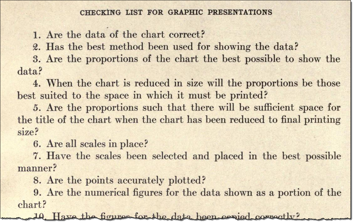
Where did this image come from? Graphic Methods for Presenting Facts (1914) by Willard Cope Brinton.

2 Comments
Add Yours →I love this list – I’m saving it to use for my own designs. But since you asked for help, I would add a question about how the consumer will use this dashboard, and whether the design supports that use. For example, if you are designing something that users can interact with, are the interaction points clearly defined? If the dashboard just gets exported to a PDF, are the business questions and answers obvious to the reader?
Thanks Phaedra – that’s a great point