
When you make a map, you can put a pin in it to show a location. What if you’re trying to show a measure at each point, eg Sales by City? I’d suggest drawing a bigger/smaller circle. Here’s a good example by Andy Kriebel showing Vaccine-Preventable Outbreaks.
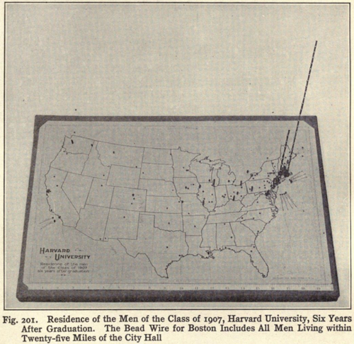
In 1914, Brinton would take you into the third dimension. The chart above shows where Harvard graduates live, 7 years after graduation.
How do you do that kind of thing? Simple:
- Get some piano wire.
- Heat it in a gas flame to stiffen it.
- Straighten it.
- Stick beads on it.
- Then varnish it for more stiffness.
Simple, right?
And if the data changes and your boss says, “Hey, minion, can you update the chart with this week’s data?”
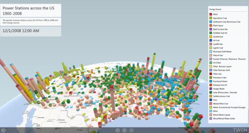
Would we do this in 2014? Brinton’s map reminds of the work being done by the Excel Power Map team. Brinton didn’t have the engaging fly-throughs that Power Map does but the essence is the same.

Recent Comments