
Matt Francis asked on Twitter:
Can you change the colour gradient of a #tableau viz divergent palette using a parameter?
— Matt Francis (@Matt_Francis) November 19, 2013
Great question. Here’s my best answer:
[sb name=”ColourChooserEmber”]
Leaving aside the question why you would want to do this it’s an interesting question. I initially duplicated the Profit measure and assigned each a separate colour palette. I figured that if I had a calculated field to switch to one of those it would work, but the calculated field, of course, uses its own colour palette and not the underlying measures.
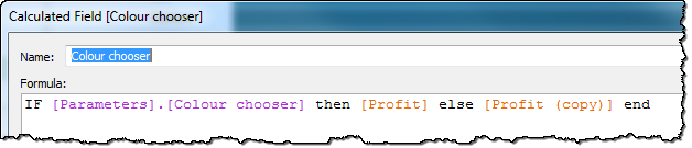
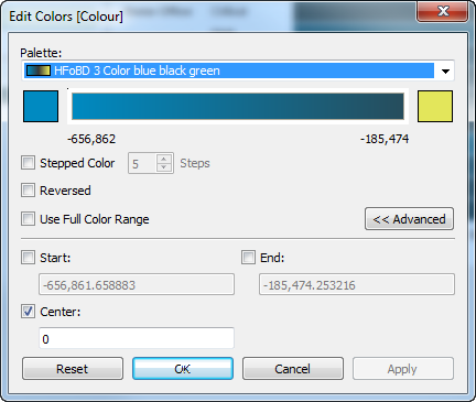
So instead, I created a calculation that makes profit negative or positive depending on the parameter, and then choose a Custom Diverging palette with a central colour in it, centred on 0:
What do you think? Are there other answers?

3 Comments
Add Yours →Hi Andy, my first though was also the diverging idea. I came up with two other options, both of which have the problem of multiple color legends. The first is to use a dual axis chart with two measures, where the first measure only returns values when the colour chooser parameter is True, and the second measure returns Null, and vice versa for the other value of the parameter. I set that up in this workbook.
The other option I can think of is to make two worksheets and to use the parameters to swap them.
Nice stuff Jonathan. I did wonder, on the way home, if there was a way to to do this with a single axis and turning off stacked marks but it’s not possible as far as I can tell: you need the multiple marks cards. I’m not a fan of swapping out views on dashboards – it always feels inelegant to me.
Now – the question remains: why would you want to do this? Matt?
I took Jonathan’s idea a step further and instead of using 2 separate color legends created a single sheet that acts as the color legend. Depending upon how many data points are included you can use squares, circles, or gantt bars to fill the color gradient and label the min and max points.
http://public.tableausoftware.com/views/Palettechooserv3/Colorchangerviadualaxis?:embed=y&:display_count=no
I could see two reasons for adjusting the color, the first is for account for color blind users and the second is to be culturally sensitive when it comes to eastern vs western color biases.