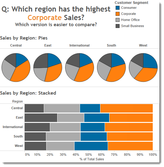
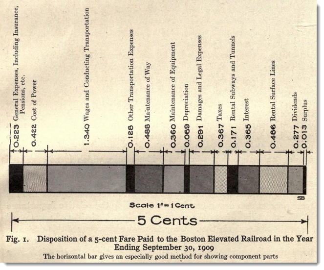
I published a post on my Brinton blog about how he disliked pie charts. In his 1914 book, he suggested stacked horizontal bars as a much better alternative. A horizontal stacked bar “gives all the data without detracting from the ease of reading the chart itself.”
I put together a quick example in Tableau. Try answering the question: Which region has the highest consumer sales? Is it easier to answer the question with the pie or the stacked bar?

What do you think? The horizontal stacked bar has advantages:
- It’s definitely easier to answer this specific question on sales/region with the stacked bar
- Comparison across Regions is much easier
- If you labelled the marks, they’d be more readable in the bar chart
But even the horizontal bar is not infallible. For example, which is the biggest blue (Consumer) segment in the Regions? It’s actually easier to answer that with the pies, because the blue segment is first in the pie charts
But I cannot deny the pies have some strengths, too. While I used to abhor the use of pies, I have certainly softened my view on pies since I last blogged about them. The debate will continue for a long time. The reason is two-fold:
- Some people use pie charts without thinking, or because they don’t know the appropriate times to use them.
- Because “it depends”. I’ve shown one specific scenario where stacked bars are better than pies. That does not mean there are not scenarios where pies are better than bars. There are.
I’m interested in your thoughts: comment below or let me know on Twitter.
I’ll leave you with Brinton’s favoured way of showing part-to-whole relationships:


1 Comment
Add Yours →How about something else entirely, like a profile chart?
for example, see:
https://public.tableausoftware.com/views/stacksorpies/SimpleProfile?:embed=y
With this view, it is easy to see a number of interesting aspects of this data:
– Consumer in the West is high relative to other Regions
– Small Business in the East is high relative to other Regions
– Consumer in the Central is low relative to other Regions
– Corporate is a high percentage across all Regions
– All data points are on the same axis, enabling lots of different comparisons
see http://junkcharts.typepad.com/junk_charts/profile_chart/ for more examples of profile charts
In the Tableau Public above, I also added some other quick views, adding an overall line, taking the difference from the overall, and then viewing that difference as a bar chart. The ease to switch perspective, trying different views to highlight different aspects is part of what makes Tableau a joy to use everyday. Thank you Andy!