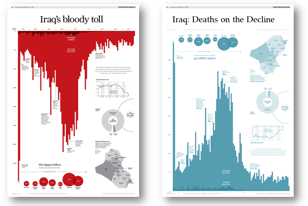
Anyone who follows my blog will immediately recognise my inspiration for this week’s makeover: Simon Scarr’s incredible Iraq’s Bloody Toll infographic from the South China Morning Post in 2011. I’ve written and spoken about this post many times in recent years.
The original source for this week’s makeover (“The Next to Die”) is a great project. It puts a new perspective on this topic, focusing not on the past but on the future. One thing it doesn’t emphasise, which I learnt by examining the dataset, is how the number of executions is dropping across the US.
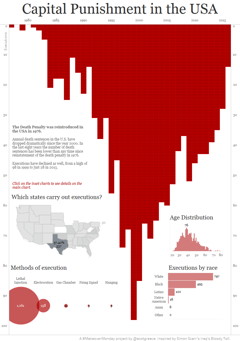
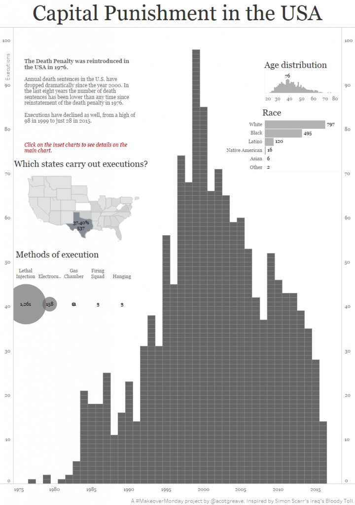
Given I learnt that the number of executions is dropping, let’s go back to my makeover. I chose red bars and made them face down: evoking a smear of blood. But if I my biggest learning point was that numbers are going down, surely orienting the bars in a normal way (ie up) would make it clearer?
Well, here you go:
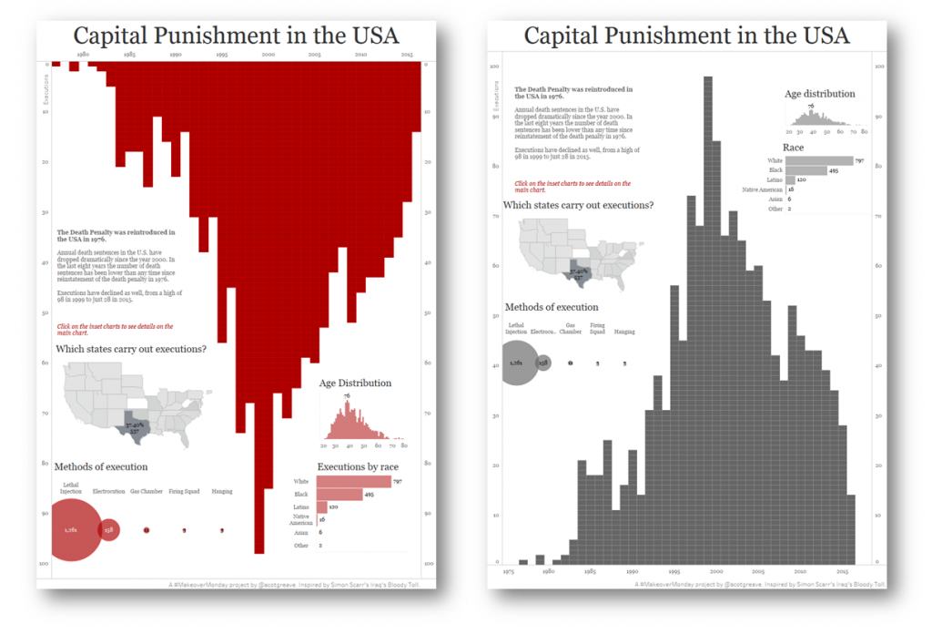
Regular readers will, of course, recognise this is what I also did with the Iraq’s Bloody Toll infographic. Here’s the Iraq’s Bloody Toll and my Capital Punishment story told in both ways.




Recent Comments