Welcome to part 2 of my series “Clear and Presentation Danger: putting data on a big screen“.
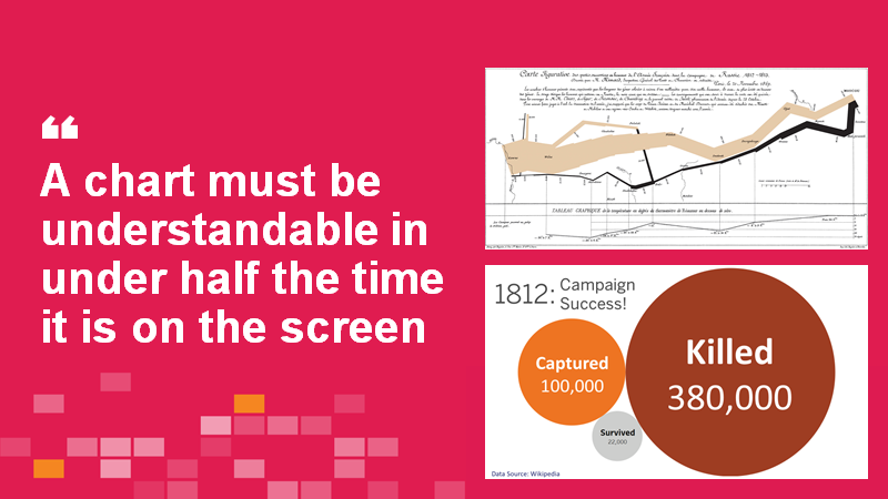
In this post, I want to share some of the masters of data presentation, focussing particularly on how they present complex charts. Remember: you can show complex charts in presentations, but they must be understandable in under half the time they are on screen.
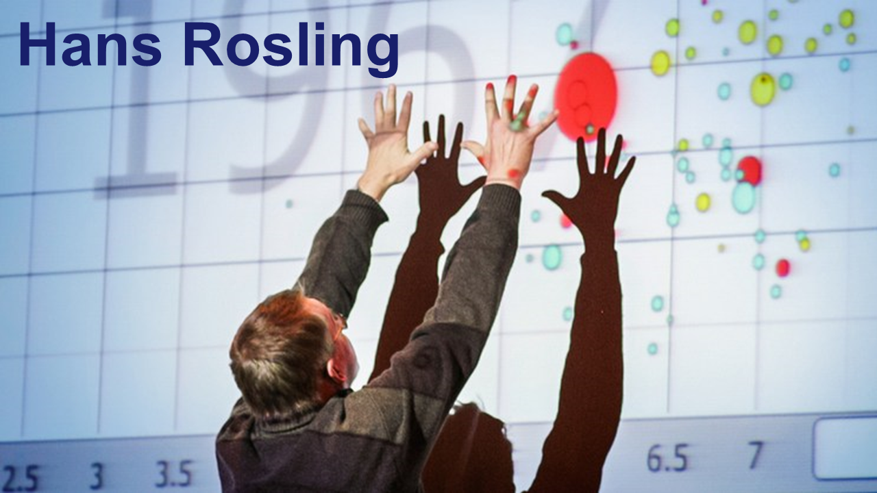
Hans Rosling
Hans Rosling was the master. His presentations were performances. I say to everyone reading this: you too are capable of presenting data like this. It might get you out of your comfort zone, but if you are trying to drive change, and persuade people, your presentation must make an impact.
Hans had the ability to take complex data and make it understandable.
Napoleon’s 1812 Moscow invasion
The video above is how I describe Charles Minard’s 1879 chart depicting Napoleon’s disastrous 1812 invasion of Russia.
Minard’s chart is complex, but given the right amount of time, can be used in a presentation. They key
If you only have a few seconds to convey a message, choose something simpler.
Christopher Cook
Would a TV audience be able to digest a complex scatterplot? You’d think not.
Well, in the video above, Christopher Cook from BBC’s Newsnight does just that; one element at a time. Jump to 50s to see the chart get built.
His slow and steady approach brings complex data to life.
Conclusion
You can show complex charts in presentations, but to do so requires time. If you don’t have time, show something simple.
If you want to be informed about the rest of this content, please subscribe to my Big Book of Dashboards newlsetter:
Recent Comments