Welcome to the first in a series of posts about showing data on big screens. If you’ve come here following my Tableau Conference 2018 presentation, I’ll be adding new content over the next few months. To keep up with updates, follow me on Twitter (@acotgreave) or subscribe to my BBOD newsletter for updates:
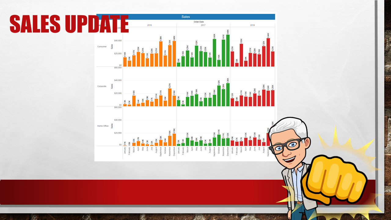
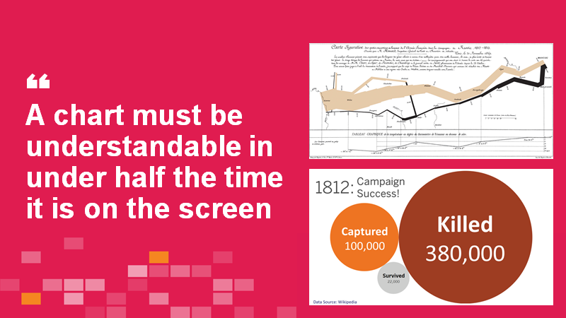
You know the feeling: you’re in the monthly meeting, the presenter puts a chart on a screen and says, “As you can see, x is causing y.” And yet, try as you might, you cannot see that x is causing y. It’s not that the chart doesn’t necessarily show it, it’s that it’s not been designed for a big screen.
Maybe it’s too complicated for the time it’s on screen. Or maybe the design is too small. Or the fonts are tiny.
Maybe the chart worked fine on the presenter’s laptop.
Whatever the reasons, the presenter is talking but their message is lost because their visuals don’t support the message.
This problem has been driving me crazy for the best part of 5 years. When I speak to people about it, I get the sense it’s so endemic, people don’t even think about it. They just zone out: they are so numb to the problem, they’ve stopped thinking about it.
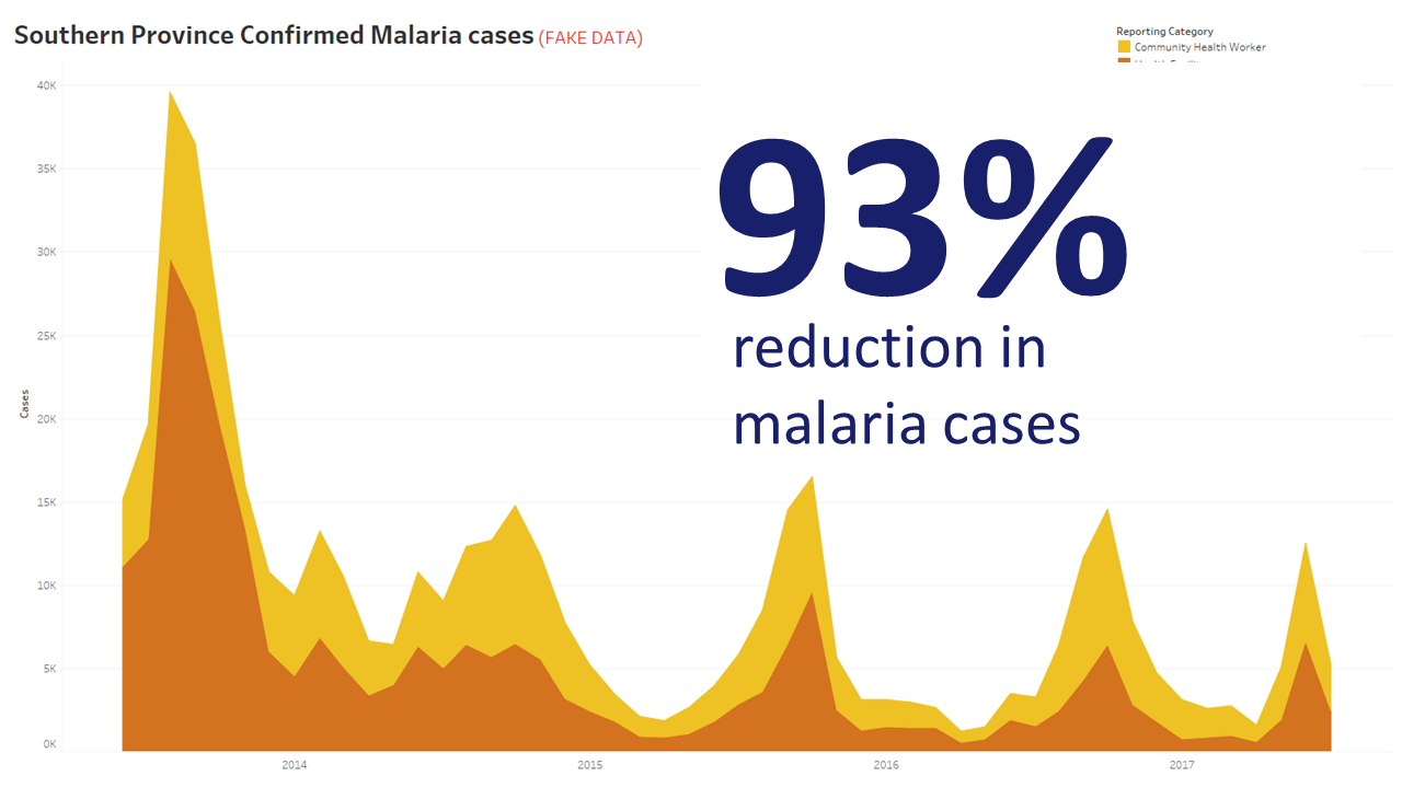
The good news, I’ve also seen lots of people do it right. Their presentations contain slides that punch home a message. Or, if they’re showing a dashboard, they take the time to explain it. At every step of the way, the slides support the presenter, and the presenter takes the audience along a clear data-driven journey.
In this series, I’m going to look at the following (they will be hyperlinked as the posts get published):
- Some examples of masterful data presentation
- Types of data we put on big screens
- How to show dashboards on big screens
- How to point (!)
- Choosing the right level of detail for your slides
- Case Studies: chart makeovers
- What’s the minimum you can do if you are short of time
A bunch of people helped in the creation of this talk. First of all, the opening sketch of my TC presentation was inspired by Cole Nussbaumer, who wrote the excellent Storytelling with Data. Also, a bunch of people responded to my tweet asking for ideas.
Also, lots of people responded to the following tweet. I’d like to thank all those who did: your ideas made it into the presentation and into this series.
What are the biggest data presentations crimes you’ve seen? What are the best methods.
Recent Comments