
The Rosetta is about to attempt to land on a comet. This is astonishing and exciting. Here’s some incredible photos of the comet on the New York Times. In honour of this event, here’s a post about comet charts:
If only I’d gone vertical and not stayed with horizontal.
I saw this tweet today:
Super work by Zan Armstrong on mix effects and Simpsons Paradox with “comet charts” for change #ieeevis pic.twitter.com/3jNkOcMKXP
— Lynn Cherny (@arnicas) November 12, 2014
“Comet chart”? But… But…. But…. I came up with that idea in 2012. How dare they steal my idea.
What? You’ve not heard about my comet charts before?
That’s fair enough: they were a doomed experiment several years ago and only ever seen in a thread on our Tableau Community. Below, in its non-intuitive glory is my comet chart:
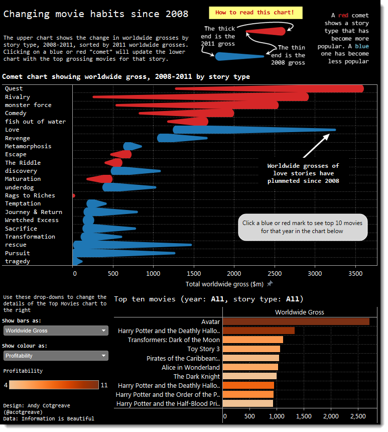
(Before I continue I’m happy to acknowledge other reasons you might decide the above dashboard doesn’t work)
Zen Armstrong’s version succeeds where I failed. Her up-down orientation fits in with ones mental image of growth/decline and gravity. If only I’d thought about trying that. In order to make my chart more readable, all I needed to do was orient the marks differently:

I focused too much on horizontal orientation in order to ensure the labels were readable. Once I’d made that design choice, I was stuck with it and didn’t see the simple change I could have made. Orientation was even something I talked about in the thread where I posted this content.
What’s the lesson? Don’t get stuck in your viz too much. Be ready to keep trying changes. Get feedback and keep experimenting.
Congrats and thanks to Zen Armstrong for coming up with her approach.

Recent Comments