
Reading articles on the process of data visualization is enlightening. At the London Tableau User Group this week, for example, Andy Kirk explained the process behind his recent work showcasing Liverpool FC’s roller-coaster season. It was entertaining and educational.
You might think this kind of thing is new, only happening in the world of meetups and blogs. Wrong!
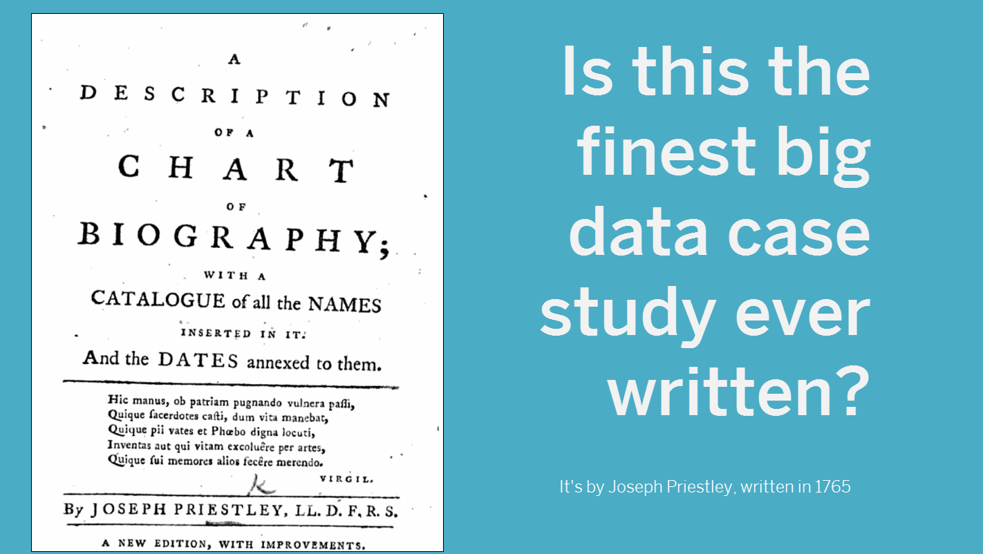
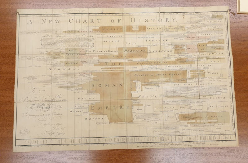
One of the earliest examples I know of is Joseph Priestley’s commentaries on his Charts of Biography and History.
In those books, you get the same challenges and opportunities described that you would do. It amazes me to read this and realise that the challenges we face today are the same as Priestley faced 250 years ago.
Ground zero of visualizing time
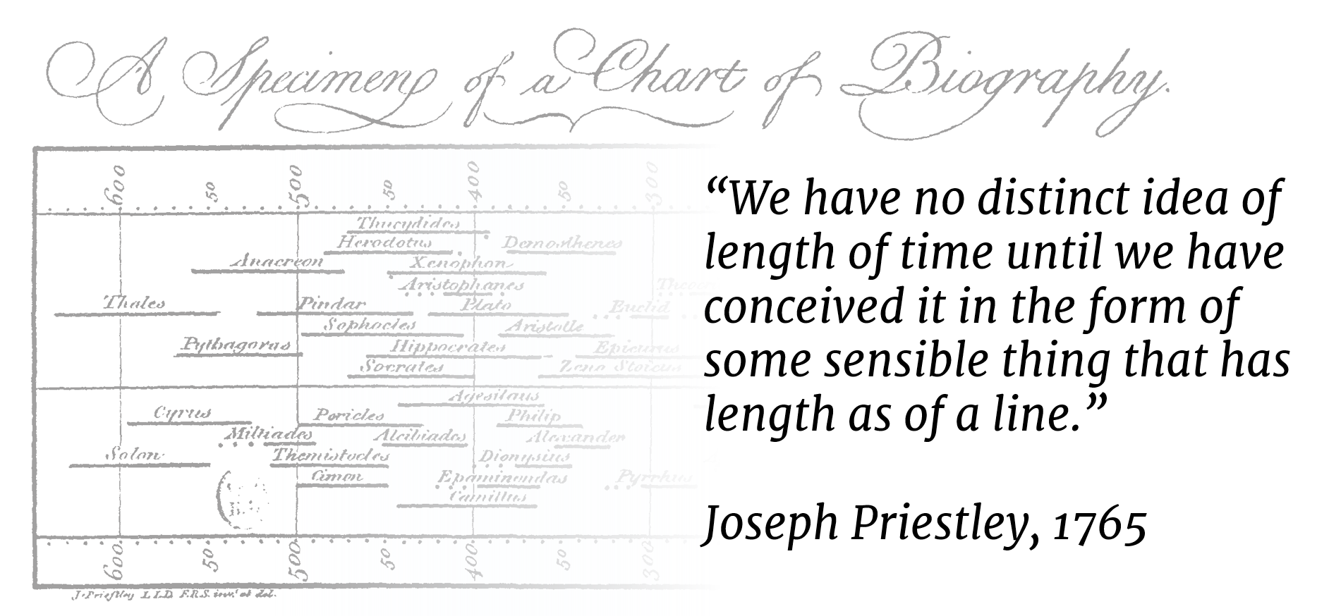
Here he is talking through his ideas of representing time in a chart:
We have no distinct idea of length of time until we have conceived it in the form of some sensible thing that has length as of a line.
What’s most fascinating is that this pamphlet IS THE START of people thinking about how to visualize time. Priestley came up with the idea of a Gantt bar, with length, to represent time. I cannot stress the importance of this enough. Today we don’t think twice about using lines and bars. But in 1765, they were inventing these ideas.
Collecting and cleaning data: a pain back then too
I shall not mention the pains it has cost me to reconcile and adjust the different values I have met concerning great numbers of them.
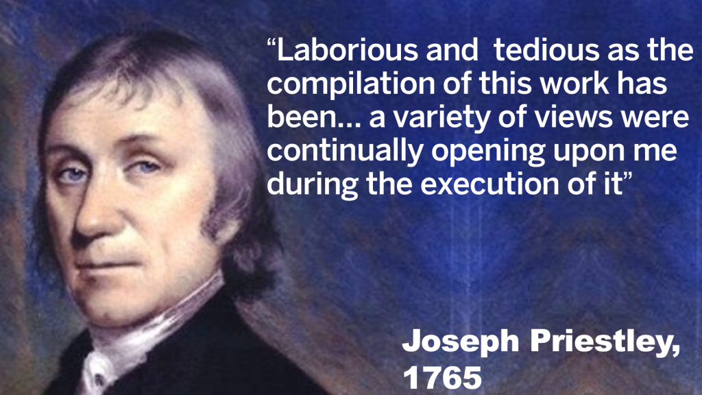
He describes the challenges of finding and cleaning data, and the wondrous opportunities of discovering new insights as he went along.
Laborious and tedious as the compilation of this work has been… a variety of views were continually opening upon me during the execution of it
Aggressive dataviz police were a problem then too
He also tries to address potential criticism head on. Dealing with the dogmatic dataviz police is still a problem in 2016, which is a shame:
No human work of such a nature as this can be expected to be faultless. I hope no candid person will think … that they are either so numerous or so great as considerably to lessen the use of the whole
It’s hard to know when to stop
He also describes the difficulty of knowing when to stop. I’ve written about this when talking about the process of data visualization. It can be so much fun tweaking and pruning a data visualization that sometimes you just have to stop.
The many times I have altered my lists convinces me that I should never revise them without seeing some reason to make farther alterations. The many times that I have replaced the same names after having rejected them convinces me that farther alterations would have been of very little consequence
He provides his data
No data project is truly authentic if you can’t access the underlying data. Fortunately, Priestley provided the entire dataset for the Chart of Biography. If you want to remake the chart or challenge his assumptions, you can!

Joseph Priestley – a legend
Joseph Priestley was an amazing polymath. Not only was he great with data, he also discovered oxygen, caused riots, catalogued electricity and was friends with US presidents (I recommend this book about him). He paved the way for data visualization.
Recent Comments