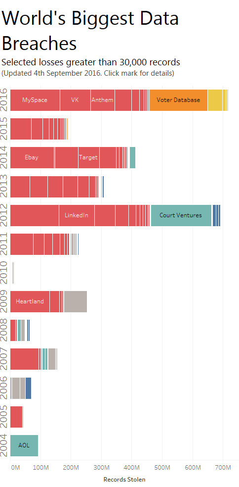
I went tall this week. There’s an interactive version here.

This month is women’s history month. Andy and I wanted to find a chart to makeover to mark the month. We found a great candidate at The Guardian.
What’s good about the original?
- It’s a powerful dataset.
- The interactivity lets you explore countries for yourself
- The clear tick/cross icons on the right highlight where a country is equal or unequal in each category.
What could be better?
- The circular layout serves no purpose. In fact, it confuses: it’s very hard to follow the categories around a circle to get to anything specific
- The widths of the arcs are set by population, but that doesn’t have any bearing on women’s rights.
- Colour is used arbitrarily.
The viz is not much more than a lookup table where you click to see details. The Guardian should have gone with a tabular layout at the least in order to make it easy for the viewer to find country/category.
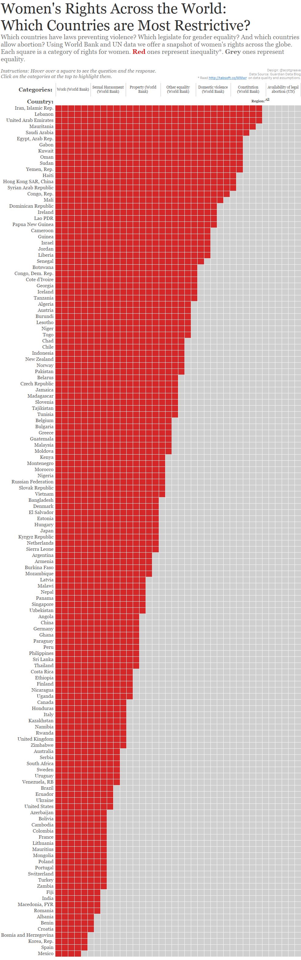
I originally intended to build the same interactive viz as the Guardian, changing only to a tabular layout. As is often the way, though, I was semi-randomly exploring the data and the above view appeared. The data is detailed so it’s difficult to know how to show everything. In my makeover, I resorted to the tooltip.
Tooltips
With a rich dataset like this, it seems important to provide an interactive rather than static chart. But how do you serve the people who will interact and those who won’t?
My design is an attempt to please all. If you don’t interact, the layout is a sorted bar chart of the countries with the highest number of negative women’s right topics. Even without interactivity, a viewer sees a compelling story.
If you do interact, the tooltips give you context. It’s still imperfect because looking up a particular topic for all countries isn’t facilitated in my solution. Although Highlighting provides a partial solution.

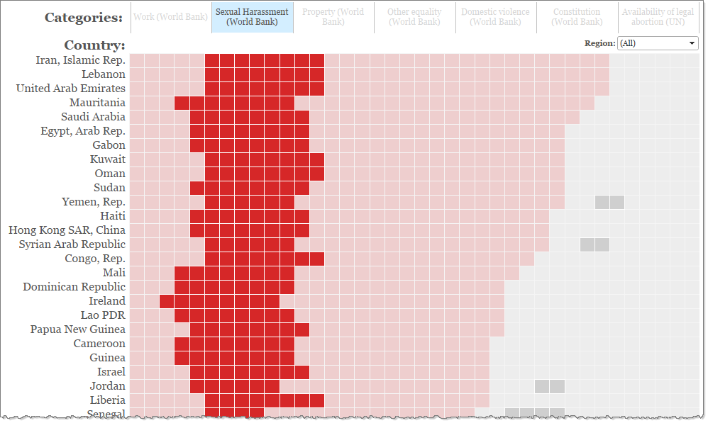
Highlighting
I am happy with my use of highlighting to let you click on a category and scan through all the countries to see how they compare, at the same time as keeping all the data visible in the background.
Data problems
I do need to note that the data is a challenge. I’d say my makeover is a proof of concept and you need to be aware of the following caveats.
- Lots of countries have answers to only a few of the categories. 31 countries with missing answers are excluded.
- For all bar one of the topics “No” represented inequality. But many countries had Null or N/A. Is that negative or not? For the purposes of this makeover I classed it as negative. It might be that they simply didn’t provide an answer.
- Some data is confusing. For example, one category is about the constitution. The United Kingdom has a “no” against all the questions. Is that because it’s discriminatory? No. It’s because there isn’t a constitution. In my viz, it’s still classed as negative. I appreciate this is incorrect, but in the time constraints of MakeoverMonday I do not have time to clean the data fully.
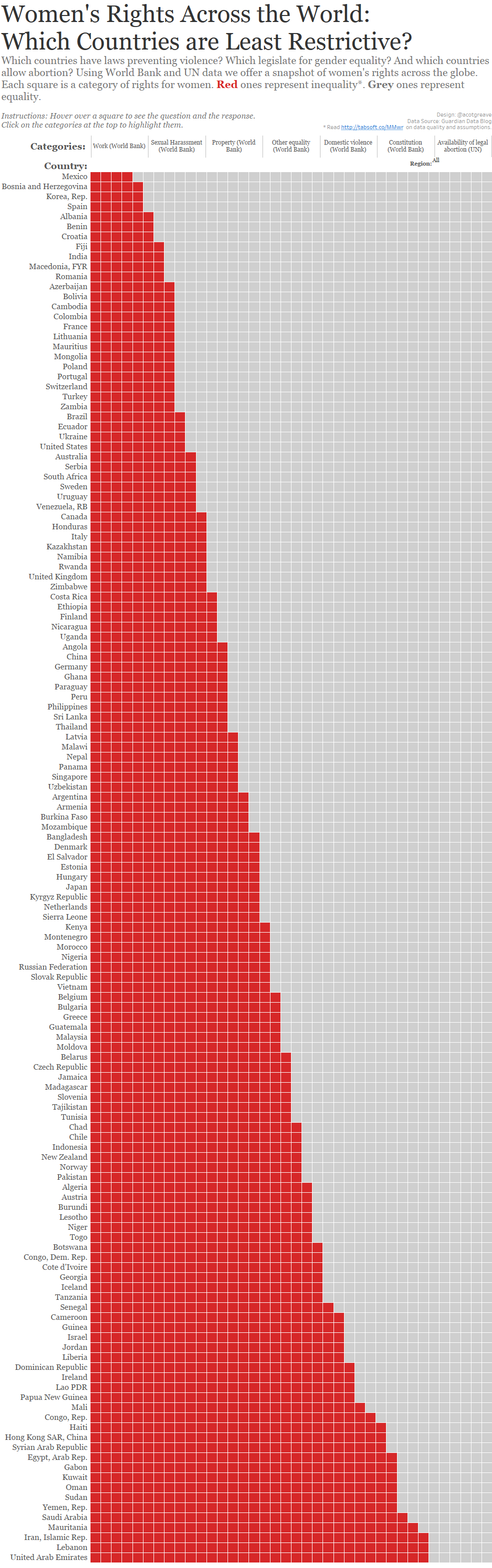
Update
Kristin Henry suggested a positive spin might be better. She’s right. My first update copied the headline and subhead direct from the Guardian. I took the lead from them, and we all know that news sites would rather tell you bad news than good. But this isn’t a bad news blog so here’s a postivie spin:

4 Comments
Add Yours →I found this solution to be a bit confusing, especially when I used the interactive version. Having the category headings at the top of the chart seemed (to me) to indicate that the squares below it were all related to that category, which they clearly were not.
I also think it is relevant to know if the responses were Null or N/A, as opposed to a clear No. I am guessing you skipped the blank questions and maybe that is the reason for the categories waggling about instead of being straight up and down?
I think that, if I were to use your solution as a starting point, I might do the following:
– Have three colors with say black representing Null or N/A.
– Have the same question in a column for every country so the answers correspond to the column headings. This would present the data in more of a checkerboard pattern that would enable the viewer to scan down and see if there are some categories where countries are faring better for women. It would obviate the need for the category selection links.
– The checkerboard display would have the DOWNSIDE, however, of making it harder to make the overall comparison that your chart is very good at. So, I would add a toggle view option that would segregate the colors to show unequal/equal/no response, basically replicating your view but adding the third category.
Hi Ann – thanks for the reply, your points are great. The No/Null/Unknown/NA conundrum was something I would have dealt with properly with more time. My solution is a cop out, based on time pressure. I tried a grid and agree it would be easier to compare countries. However, I wanted to answers to form a bar (more red=more negative answers). It means it’s hard to look up and compare, but every choice is a compromise 🙂
Thanks for the kind words – this project has become something I did not expect.
I agree with Ann’s points.
I love (once again) that your makeover has a focus on simplicity – being able to view the matrix as an ordered bar chart is fantastic.
Being able to compare each country in a proper grid would also be fantastic, of course. The idea of toggling between the collapsed, bar, view and proper matrix would be a great idea.
With such a large data set, a single chart that does everything well is clearly not an option, and I think your compromises have good reasoning behind them.
What I’d really like to see with this data is some aggregation, some distributions, some comparative stats. But yes, that would be pretty time consuming 🙂
BTW, I’d like to thank your for doing this Makeover Monday exercise! I look forward to it every week. It is really interesting to read your critiques of what works and what doesn’t and to see your approach to presenting data in a clearer and more meaningful fashion.