
We got to makeover with my favourite dataset this week. The full wildlife strike dataset is one of the best to explore. It has a great mix of measures and dimensions, and seemingly endless stories to find in it.
Our source was Kelly Martin’s excellent take on the data. Is it an amazing dashboard? Yes, without a doubt. Is it perfect? Of course not: the perfect visualization does not exist.
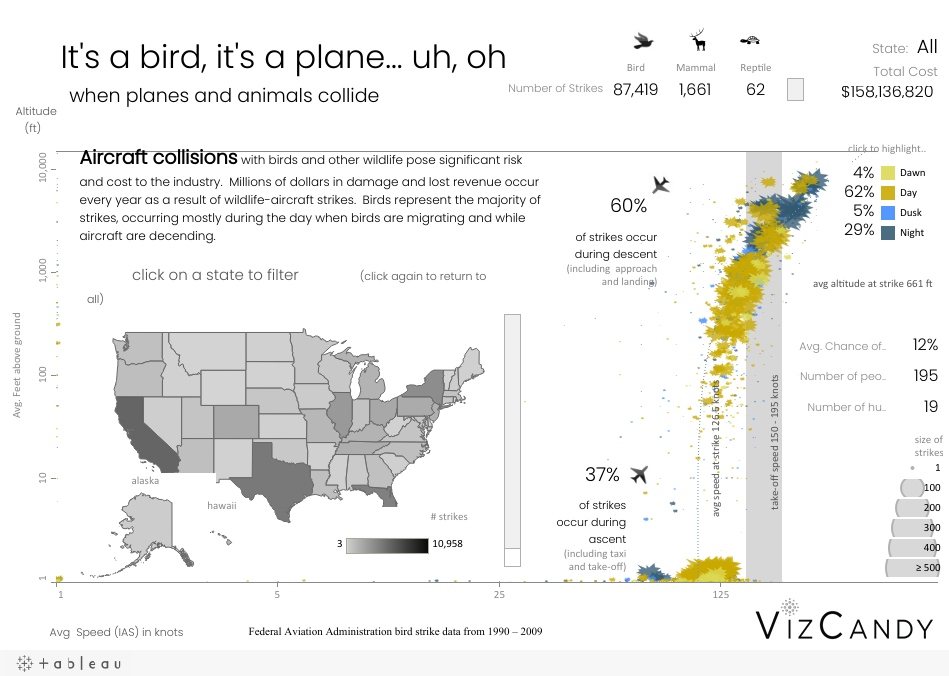
There is much to love about Kelly’s dashboard. Here’s a few things that stick out:
- Lovely title – a play on Superman motto and sets up the viewer for exploration
- Really nice layout with enough intrigue and flow to keep the viewer’s eye moving around the views to find out more
- Effective use of colour: only one view has colour, which I find very pleasing to look at
- Great annotations add some focus where it’s needed.
- Log scale on y-axis condenses the data nicely (but be honest, did you notice it?!)
But all dashboards can be improved. Here are some of the challenges with this dashboard:
- The axes are ‘invisible’. I think it took me several return visits to this dashboard to even notice the x and y axes. They seem to be a long way from the data, but there are actually some data points right at the left hand side. Have you ever noticed them?
- The floating map and extent of the axes make me wonder how many data points are hidden behind the map? I suspect not many because low velocity strikes must surely happen on the ground.
- It’s not clear what the marks on the scattterplot represent. They’re beautiful, for sure, but ask yourself (without using tooltips): what does each mark represent? I was unable to answer that question. Even with the tooltip it’s hard to describe what each mark shows. Don’t believe me? Then tell me in the comments what each mark shows, and how long it took you to work it out.
Recent Comments