
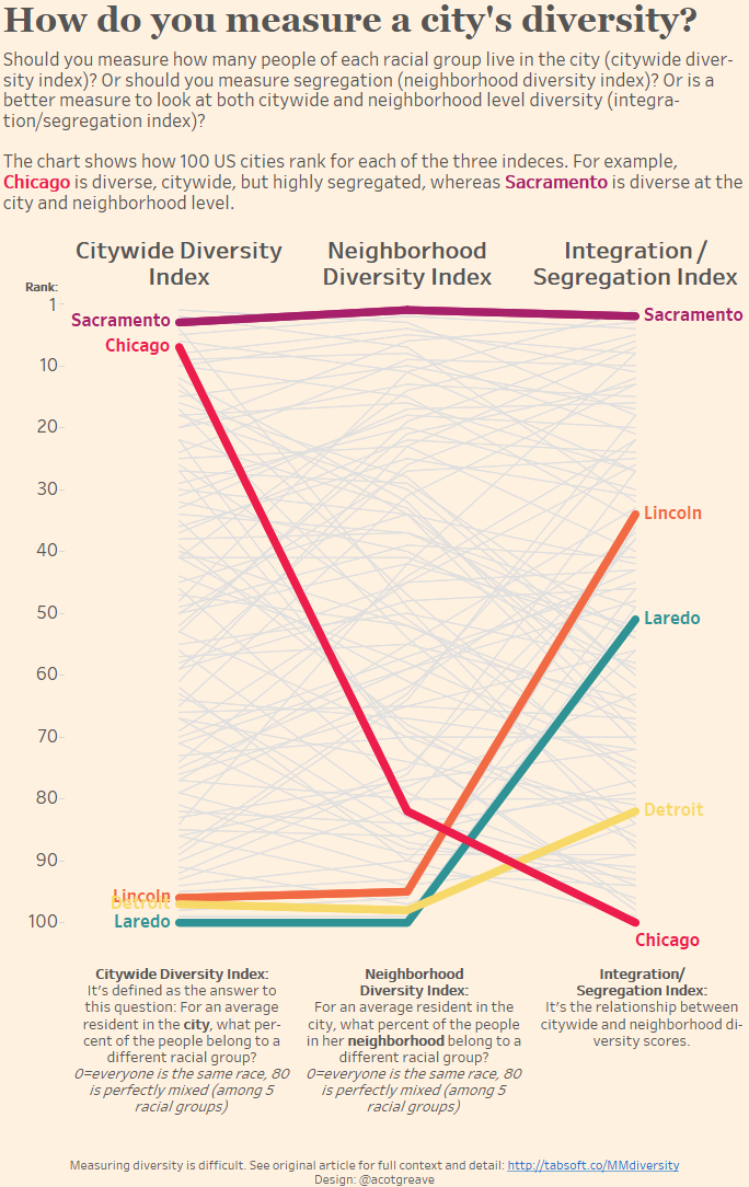
Hi gang. Unfortunately, this week has seen time get away from me. This week in the UK is a Bank Holiday. You don’t need to cry me a river, but after three days away, a long drive home, and fatigue setting in, I’ve not had time to do a finished Makeover today. I’ve also spent a good long time catching up on this week’s #MakeoverMonday tweets – what an amazing effort everyone’s put in this week!
I did try out some ideas.
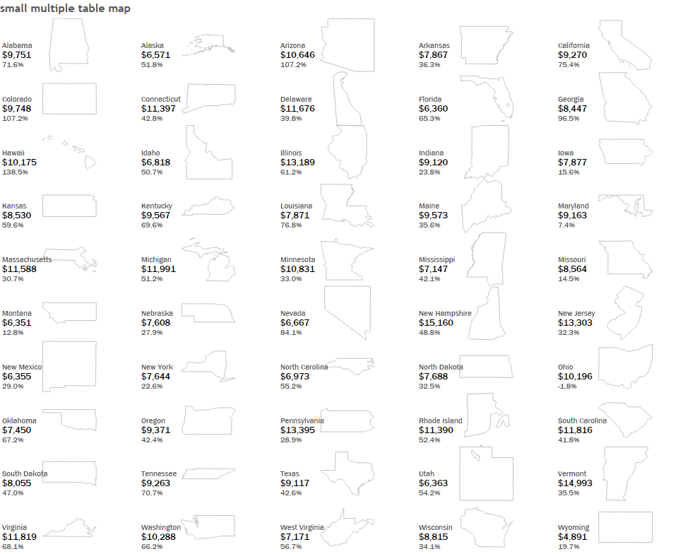
I spend ages trying to create a table using panel chart techniques, but I couldn’t find a way to make it right. I submit the above for this week’s Makeover, even though it simply did not work. There are some other ideas below. Or go check out my workbook.

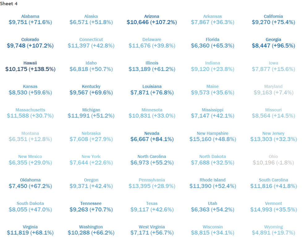
This week’s original had a mix of good and bad.
The good:
- I like the idea of mixing map and bar chart. You get the geography and a precise way to compare states.
- The bar chart is sorted, so you can easily find the biggest and the smallest tuition fees.
- The map has Hawaii and Alaska included, inside a compact space.
What I’d improve:
- It’s crying out for interactivity! I want to hover over this and see some details, and link the map to the bar.
- The colour scheme is really saturated. It’s a bit too overwhelming, as if the whole thing HAS BEEN DESIGNED IN CAPS LOCK. I don’t know where to look first.
- I do not like vertically oriented labels on the bar chart. If you want to label the bars, orient the bar chart vertically, too, and put it on the right-hand side of the map, not below it.
My other approaches included parameter driven highlighting, a butt-ugly small multiple state map and a small multiple area chart. They all had potential, but I’m out of time this week.
1 Comment
Add Yours →Here’s my take on this. What do you guys think?
https://public.tableau.com/profile/antonio.peredo#!/vizhome/AverageTuitionintheUnitedStates_2/Dashboard5