
This is it! The FINAL MakeoverMonday of 2016. What a year it’s been. Thank you to everyone for making this project something exceptional.
Anyway – here’s my makeover. The light of the christmas star shines upon my data this week:
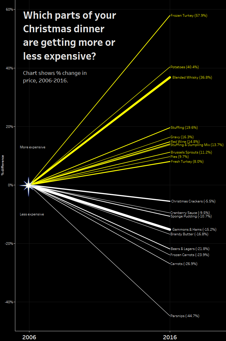
If you celebrated Christmas yesterday, I hope you enjoyed the food. Did you consider how the price of all those parts of it have changed over time? I hadn’t, and the dataset was fun to explore.
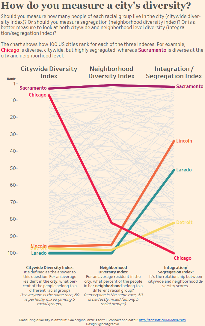
Here’s a secret, I really wanted to make the one below my “official” entry to this week:

I love the way it looks like rays of light shining down. Unfortunately, I couldn’t bring myself to make this the “official” one because when the slope lines are pointing down, you just can’t label the lines, which leaves you with a pretty viz but one without insight.
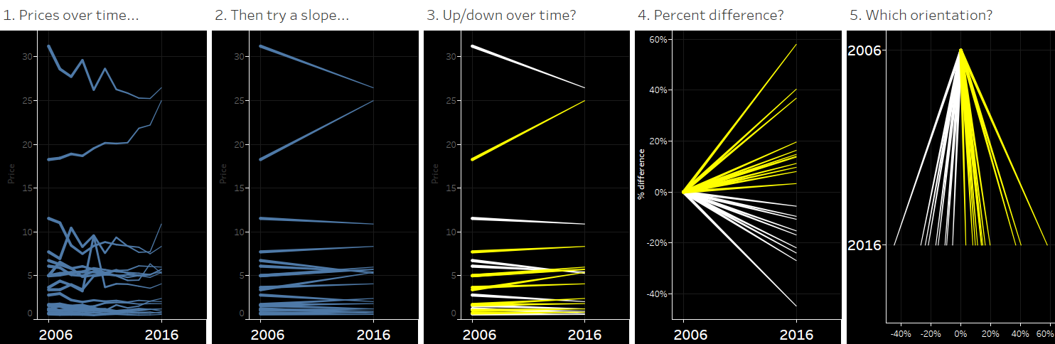
How did I get to this? This was one of the quickets Makeovers I did. Line chart, slope chart, % difference and then the idea for the star:
I’m full of turkey, and goodwill, so this week, I’m not doing any commentary on the original from the BBC.
Next week is a new year. We’re going to stop recording stats and updating the Pinterest board, but MakeoverMonday will continue with new datasets each week.
Recent Comments