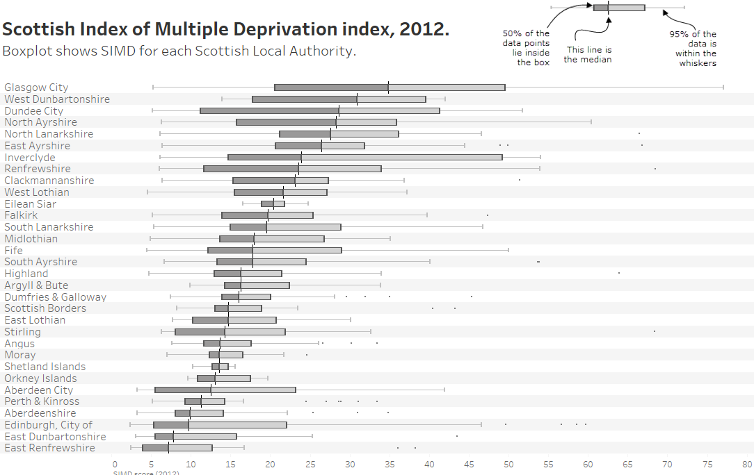

My first thought on seeing this week’s original was to try another way to show distribution. I turned to the boxplot, an under-appreciated chart. Steve Wexler, friend and co-author of The Big Book of Dashboards, really dislikes them, suggesting that laypeople don’t understand them. I disagree, and think that a lack of understanding is only caused by lack of exposure to them.
Hopefully my “How to read a boxplot” instructional image at the top helps those unfamiliar with them!
Boxplots pack a large amount of useful info:
- The whiskers spread to show outliers. Glasgow has a high SIMD score, but the data is very spread.
- Comparing location is much easier. Consider Glasgow/Dundee in the original and the boxplot:
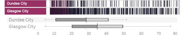 It’s much easier to compare the two cities in the boxplot.
My boxplot still needs more work, which I would do with more time. I think it’s important to know how many data points are in each category. The Shetland Islands has a really narrow box, but that’s partly because there are only 7 items, compared to, say, 133 in Glasgow.

1 Comment
Add Yours →I like it.
Boxplots were my first thought when I saw the original.
I think they are the most logical choice. I’d almost say the obvious choice.
I also find the idea that a ‘layperson’ can’t understand them to be silly.
Nobody can understand them until they’ve been explained, and once they’ve been explained properly, they’re fairly straightforward.
They obviously don’t give the most complete picture of a distribution, but they often give the most concise picture.
I think for a chart comparing a large number of categories such as this, that concise picture is exactly what’s called for – good choice.
In your particular case, I don’t think I like the dark shading on one half of the box – it seems to imply more meaning to the median line within each category than is warranted (as in, above median within each category is one qualitative state, below is another).
I would much rather see something that marks the overall plot in terms of good/bad, or imply average/median instead (one of the good parts of the original was the plot shading for the bottom %, for example).