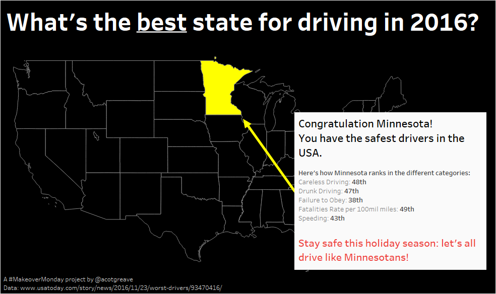

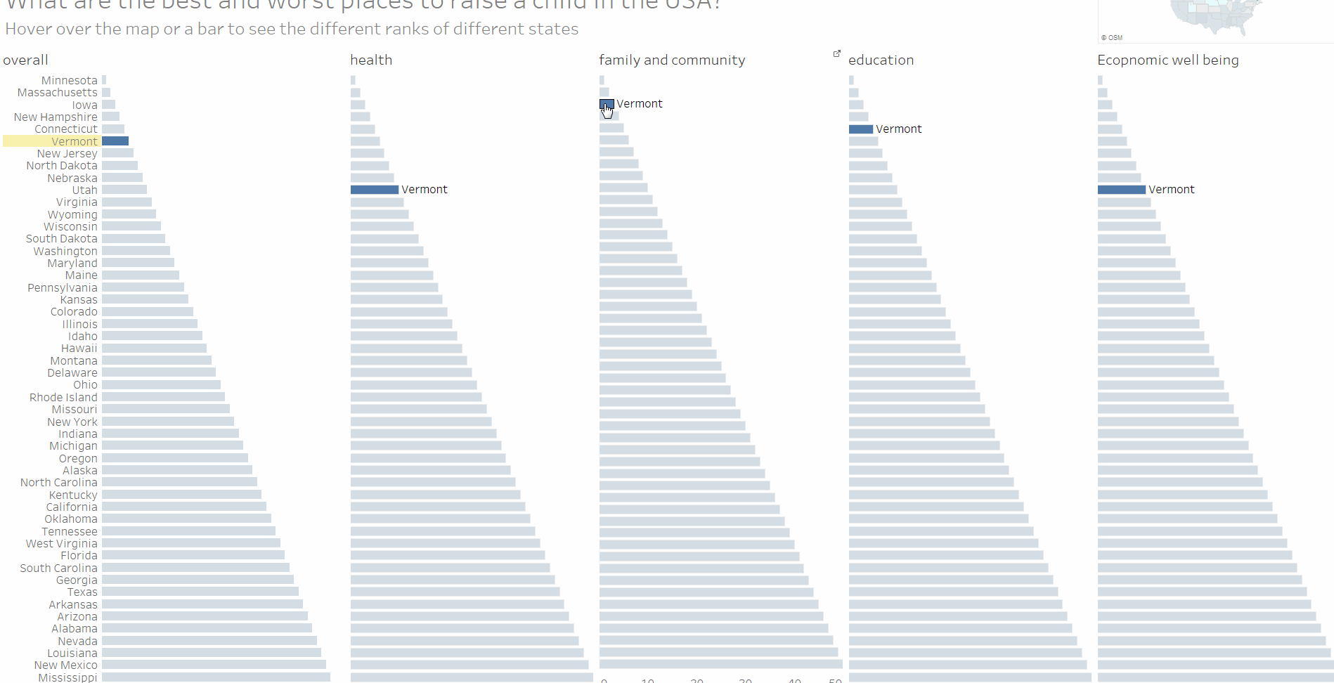
This week’s original focusses on the worst states to drive in. It’s nearly Christmas so I wanted to turn that around and take a more positive approach: which state is the best. Turns out it’s Minnesota.
My makeover removes almost all detail (ie 49 out of 50 states!) but I decided after exploring the different metrics to focus on a single message: stay safe, rather than let people investigate the data in each state.
You can see that process in the GIF showing my exploration, below. I looked for correlations and patterns, but once I hit the map, I realised I wanted to focus on Minnesota, and spent about half my time getting the display just so.

The original
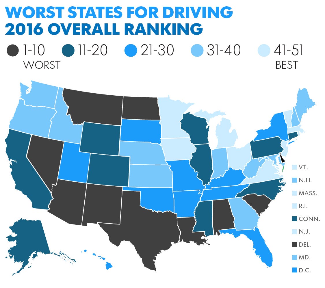
There are things to like in this week’s original:
- The colour bands are groups rather than every individual rank. It’s easier to identify a colour band representing 1-10 rather than trying to find the one ranked 6, for example.
- Maps make it relatively easy to find your state.
- They’ve labelled which is best and worst. Should 1 be “worst” state or “best”? They made a decision and labelled the legend.
- The small states have their own callout rectangles.
What don’t I like?
- I didn’t notice the “Next” button until writing up this blog. Turns out there are 3 charts, but I didn’t notice them.
- Choropleths distort values because one value covers large areas.
Recent Comments