
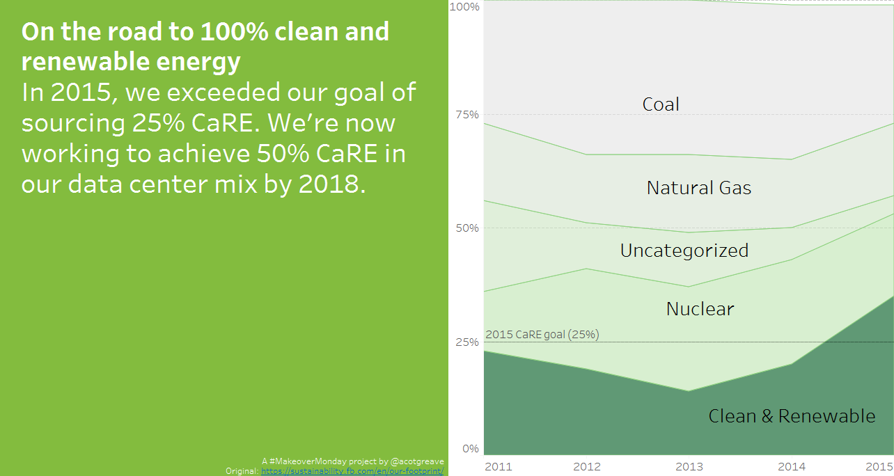
We’re hoping to bring attention to work helping fight malaria. Go check out how you can help #VisualizeNoMalaria here:
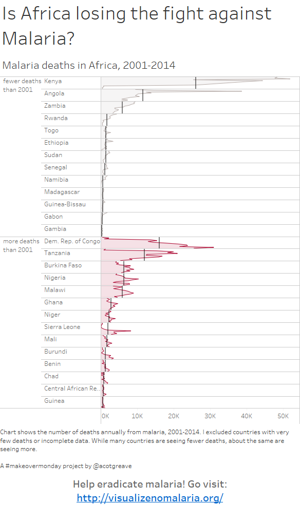
I found myself doing something simple and possibly too experimental. I looked at which countries are seeing growth and decline in Malaria deaths. It turns out that, for the countries with good data, there’s a balance of impriving and worsening countries. Overall, the number of deaths has been pretty static since 2001. Not great news.
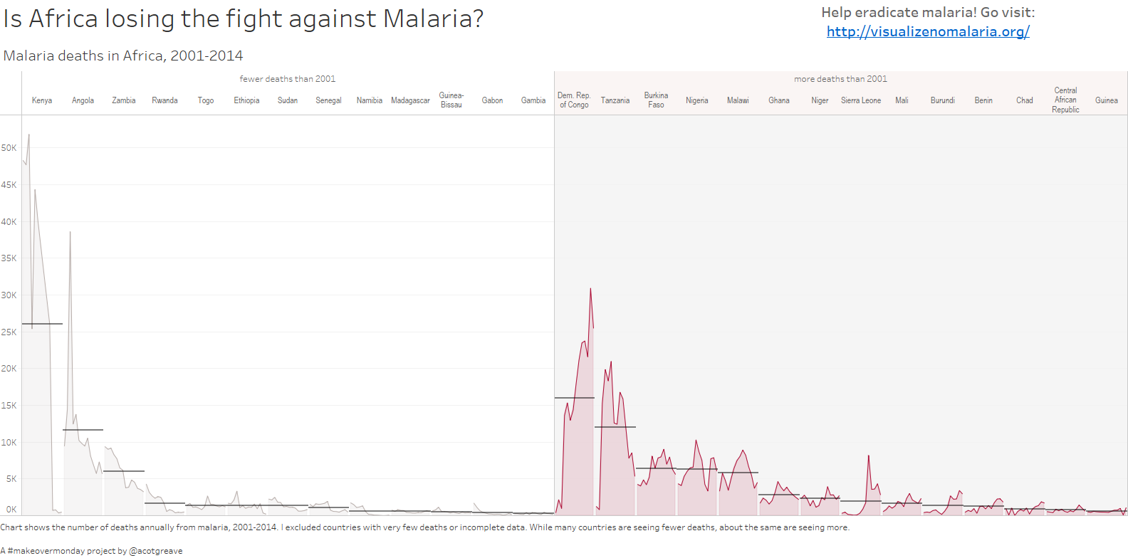
My original layout was horizontal but I couldn’t get the country labels to align nicely or fit, so I went for the vertical layout, even though “you should never do vertical time series.” Well, I just did. Below is the horizontal version:
Recent Comments