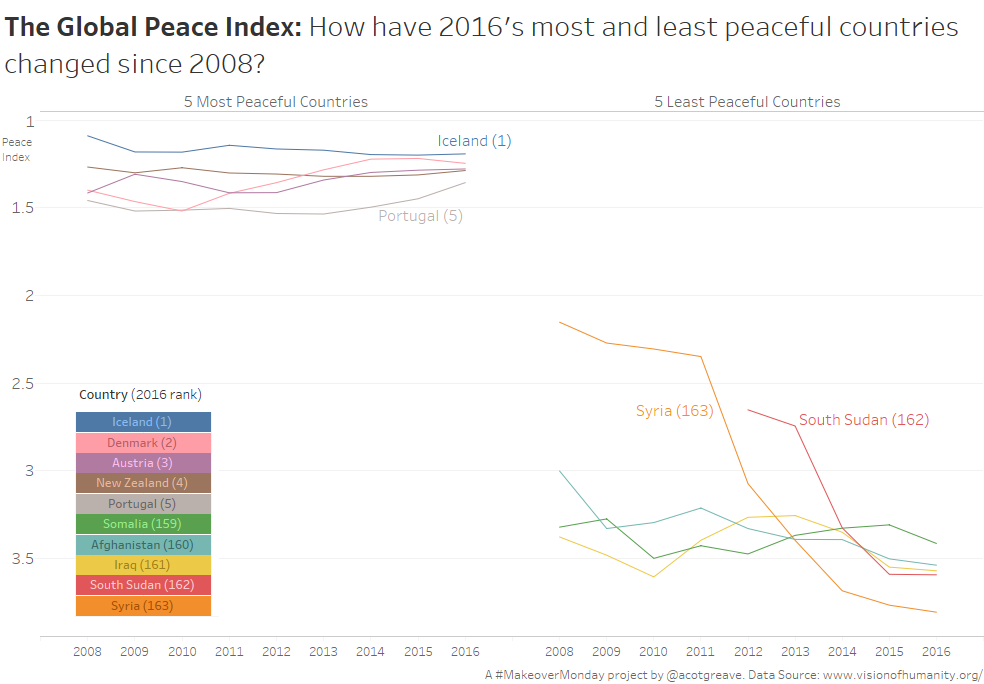
A quick one for me today. As I explored this data, what struck me was the stability of the most peaceful countries, compared to the volatility of the least peaceful countries. What I hope my chart emphasizes is the depth of the tragedy for Syria and South Sudan. All of the countries at the bottom of the chart are facing terrible situations, but the descent of Syria from a largely peaceful country to the worst in the world is awful.
Vision of Humanity, our source for the week, do a great job visualizing data. Their Global Peace Index is a readable report, with some excellent charts embedded in the flow of the stories they tell.


Recent Comments