
A first for MakeoverMonday: I ended up pretty much remaking the original chart, with only small tweaks. Once I’d locked onto the story I wanted to tell, I couldn’t escape the fact that Facebook’s original version of this chart was pretty much just right. In fact, it’s possible that I’ve complicated the message with my version.
How did I get to my version?
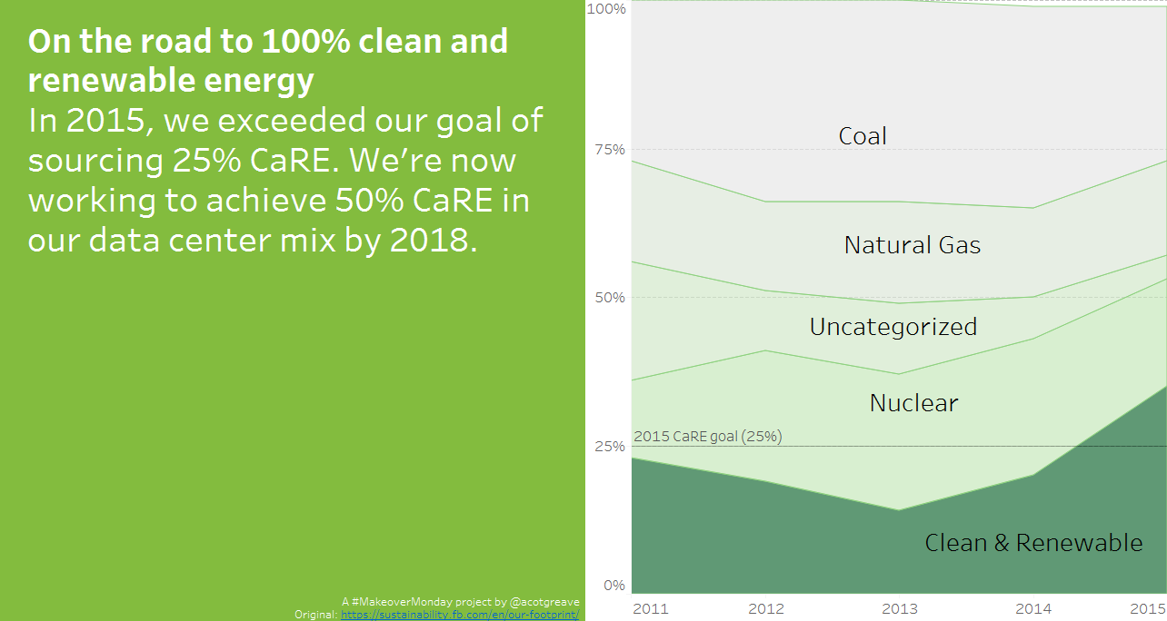
I thought Facebook’s whole report was fascinating. I learnt a lot from this graphical report.
As I explored the data, and cross-reference the report, it all seemed to hone in on the amount of renewable energy being used. The power usage itself is interesting, but the ambition for Facebook is to get the CaRE up to 50% by 2018 (and ultimately 100%).
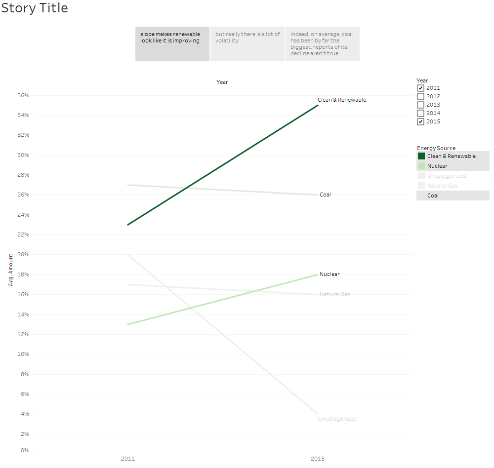
I tried to draw a slope chart first, but it looked too sparse. Also, it hid what I thought was some important information – the volatility of CaRE:
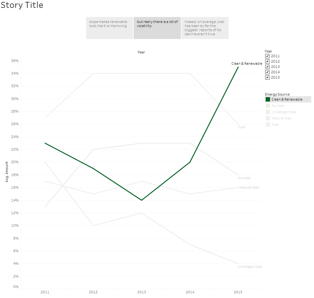
I wanted to pursue this volatilty because it’s hard to say there’s a long-term trend upwards for CaRE when there was such a big trough in 2013. Unfortunately, I couldn’t find that information in the report.
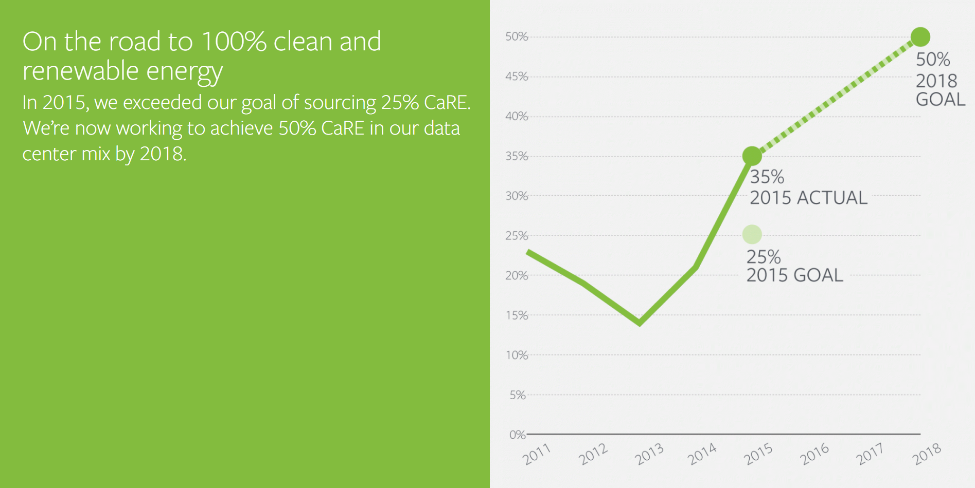
Without the information on the volatility, I figured I’d accept Facebook’s word and focus on Facebook’s hitting the 25% CaRE by 2015 goal. As I drew different versions, it seemed that only a line chart or an area chart with CaRE along the baseline made the point. The other energy types are secondary information: as long as CaRE is going up, I don’t really care too much what’s happening to coal and nuclear.
What do I like about the original?
- Annotations on the marks explain the data
- Headline on the left summarises the point being made
- Forecast line has a different format
What don’t I like about the original?
- The x-axis year labels aren’t horizontal, and they don’t align very well to the marks themselves
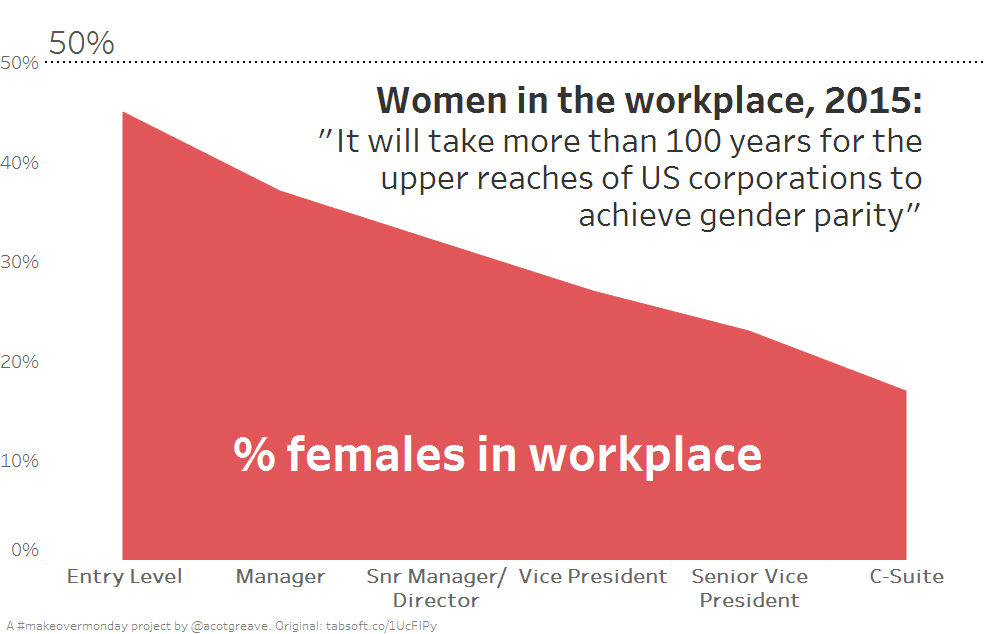
- The y-axis % scale only goes up to 50%. On the one hand, this is fine, because it fits the range of the data. On the other hand, 35% means that 65% of data is still not renewable.
My changes
- I used an area chart, with faded colours for all but CaRE to add context to the main story about CaRE usage
- This choice also forced the y-axis to go from 0-100%. Now you can see that while goals are being hit, companies with huge data centres still have a long way to go.
- I added a reference line for the 2015. This helps imply that the goal is continuous. The goal doesn’t stop in 2015.
Recent Comments