Flowing Data have announced a new Visualise This challenge. Here’s my response:
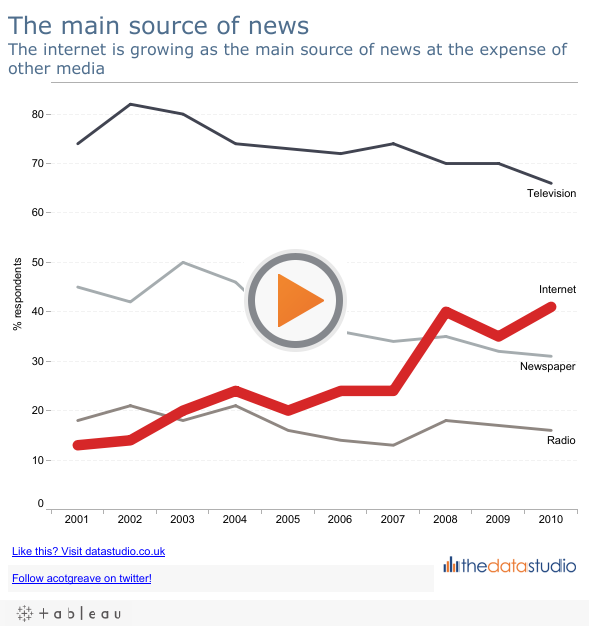
You will notice that it is similar to the original. Why? As Nathan says in the challenge, the chart isn’t too bad. I chose to clear things up in order to emphasise the story. The original was too busy and the rise of the internet at the expense of other media was concealed by noise. Breaking the chart into small multiples in this case wouldn’t show this message as clearly as overlayed lines would. Making a stacked line/area chart also wouldn’t work because respondents were allowed to choose multiple answers.
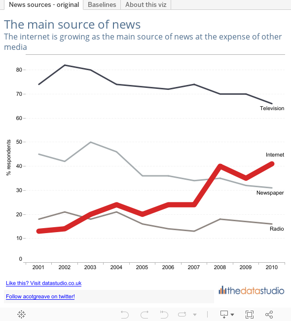
Update: I added a baseline tab so that you can see the change of sources relative to a single one in response to Matt’s comment. I hoped this would emphasise Internet’s growth relative to the others. I;m not convinced this is better than the first worksheet. Why? Because the viewer has to do a little more thinking in order to understand the story.

6 Comments
Add Yours →I’m not sure I agree with the comment about the internet growing as the ‘main source of news; The graph doesn’t actually show this at all, it does show a considerable growth over the past ten years, but it still has a long way to go before it beats television.
Hi Matt
Good comment – my title should read as “peope’s main source of news”.
Here is my version that allows for a comparison of the different viewpoint options: http://goo.gl/MAvSn
The only thing I would change is to have the y-axis, % responses set all the way to 100%. 100% is the max possible and it would better communicate the potential gain possible for each “source of news”. The chart in its current form makes the data feel like Television hit near its full potential in 2002.
Just a thought.
Rob, that’s a great point. If I remember, and have some spare time, I will update the axis.
Thanks
Andy
Andy, thanks for the graph! That’s a good one. Appreciate it as i was looking for a similar graph for one of my upcoming presentation 🙂 Thanks again!