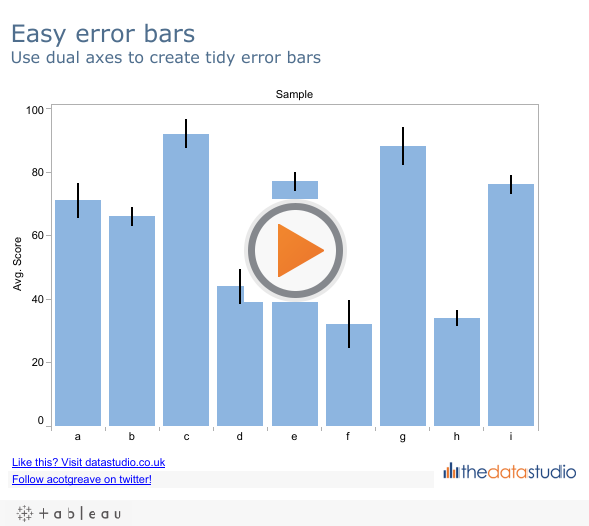
Over on the forum, Hadbar asked a question about Error Bars. He asked the question back in the days of version 5, when it wasn’t straightforward to make a pleasant error bar. However, now we have the Joy of Six, we can use the new dual axis/multiple mark features to create some visually appealing error bars:
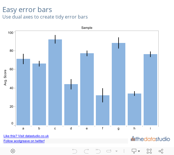
Tableau won’t calculate the error values for you, so you need those in your dataset. With this example, you need two measures:
- Error – the magnitude of the error
- Error lower – the lower limit of the error bar
Here’s how we build the viz. First make a regular bar chart with the relevant Dimension and Measure, as below:

To create the error bar, we build a Gantt chart on the second axis. It’s lower limit is the value of the Error lower measure, and it’s size (height) is the size of the error. Step one is to put the MIN(Error Lower) pill on the Rows shelf, and set it to use Dual Axis (click the picture to see details):

We’ve now got a dual axis graph, but there’s some way to go yet. The Error Bars need to use a different mark type, in this case a Gantt Bar. Right-click on the axis, and choose Mark Type…Gantt Bar:

Set the Size of the Gantt Bar to the size of the error. To do this, make sure the Marks shelf is showing the correct Mark. In this case, it’s MIN(Error Lower). This is a new feature in v6. In case you’ve not seen it, you can page through all the Marks:

Once you have found the correct mark, put the Error measure onto the Size shelf – that creates the Gantt bar with the height of the error. You’ll probably now notice that you have error bars, but they’re wide, and not in the right position relative to the bar. This fat bar problem is easily fixed – just slide the Size slider on the Mark shelf to be the smallest possible. That creates a nice thin line.
How to get the error bars to align correctly? Simple – right-click on the axis and choose Synchronise Axis. While you’re there, you don’t need to show the right-hand axis at all. You can’t properly hide axes in Tableau, but you can format them so they don’t appear. Right-click on the axis and choose Edit axis. Delete the title on the General tab, and in the Tick Marks tab, set the Minor and Major Tick Marks to None. Click OK and your axis has “disappeared”.
Lo and behold – you have some error bars. Play around with widths/colours and other settings to make it appear just how you want it. Coming next in the Joy Of Six series…. using parameters to create dynamic groups.

2 Comments
Add Yours →Andy….you keep cranking out very nice blog posts. Keep up the good work!
That is a nice solution for what I think should be a built-in feature… Don’t understand why calculating error on a data set is not something more people have requested!
My problem is that some of my bar charts are already aggregate functions, and I like that because they can be updated for different filters, people, etc. The graph is a simple two-bin bar chart for different dates that can be filtered by all people who contributed data or any subset.
Challenge:
How can you have error bars be calculated for each filter? I can’t hardwire the std error for every possible permutation of date/person (I could but I would rather not spend my time that way).