
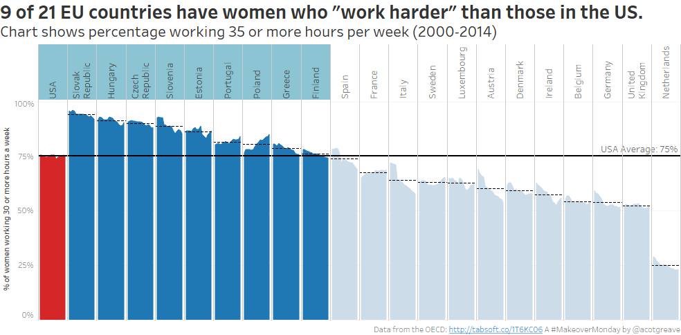
Boy, the Americans need to get saving. That’s what I discovered this week. The source chart was a stacked bar. This is an interesting choice by Andy: the chart wasn’t a total disaster, but there’s certainly room to play around with it.
Also, stacked bars have been much debated recently. Stephen Few has argued that, if a time series is involved, you should always use lines to represent the category instead of bars. Cole Nussbaumer and others have made the case that while the lines allow for clearer comparisons, they don’t show “part-to-whole” relationships as well as stacked bars. You should go and read the fascinating debate on Stephanie’s and Steve’s blogs.
Here’s this week’s original chart:
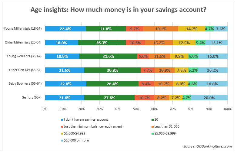
What do I like about the original?
- It asks a clear question
- You can look up every single value, even if it takes a while
What could be improved?
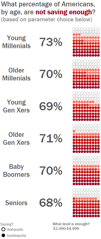
- Double-labelling the category is overloading. I chose to just use the category name (Baby Boomers) and not show the ages. I acknowledge that means that if you don’t know the ages of those categories you’re stuck. However, the message is still clear, I believe
- The colour scheme is arbitrary
- Moving your eyes between the legend and back again is difficult.
So how did I go about my makeover?
I first tried a diverging stacked bar, a method developed by Steve Wexler. He places the “negative” categories to the left of the axis and the “positive” categories to the right. This allows you to see more easily the overall positive/negative leanings.
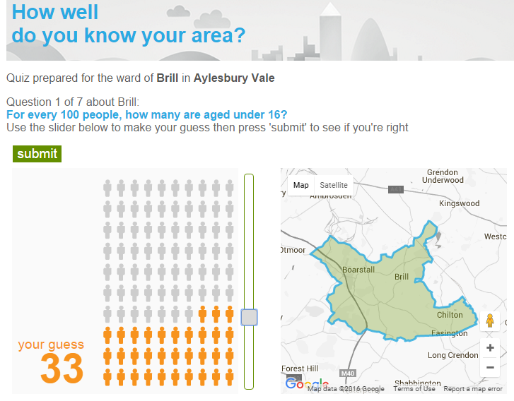
However, my diverging stacks didn’t thrill me, so I thought I’d try a unit chart instead. I like the way they simply represent percentages. I was always struck by the brilliant simplicity of the ONS’ “How well do you know your area project” and wanted to do something similar.
I confess I had to construct a separate dataset to make the unit, because in Tableau every dot needs a separate record (although I suspect Joe Mako could make it work with just two rows)
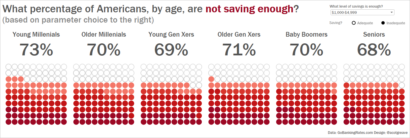
Once I had the data, I played with shapes and settled on blank/filled circles to show the threshold between adequare and inadequate savings. I chose a colour scheme which still showed the different inadequate saving levels (e.g. “no savings account” and “under $1.000”), but all within a red palette. I also added a parameter to allow you to set the level of “enough savings”. You can play with that by opening the interactive version.
I also created a horizontal and vertical version. The horizontal one works well in tweets, the vertical one is better in a blog. Font choice this week was inspired by Kelly Martin’s amazing Font Choice blog post.

Recent Comments